Tired of your premium products looking like “DIY” projects because of fuzzy packaging? I will show you exactly how to bridge the gap between Canva’s digital canvas and an industrial printing press to get professional results every time.
To ensure Canva labels don’t print blurry, export designs as “PDF Print” at 300 DPI resolution. Use vector SVG assets for logos, maintain a minimum font size of 4.5pt, flatten all transparency layers to avoid artifacts, and set deep backgrounds to a Rich Black CMYK profile for maximum clarity.
But there is a catch: even the right export settings cannot save a design with poor asset integrity. Read on to discover the “400% stress test” and the specific font safety list we use at my factory to intercept blurry prints before they ever hit the production line.
1. The Source Asset Integrity Check

Your final print file is only as good as its weakest link. A common mistake founders make is using a high-resolution Canva template but uploading a brand logo that was originally saved for a website header.
While a 72 DPI (dots per inch) image looks crisp on a smartphone, it lacks the “DNA” required for high-end printing.
Andrew Hurley, Ph.D., an Associate Professor of Packaging Science at Clemson University, often notes that 90% of printing failures are determined at the export stage. The difference between a hobbyist and a professional lies in “technical readiness.”
The Solution: The 100% Zoom Rule
Before you begin designing, check the “bloodline” of your assets. If you upload a JPG or PNG, zoom in on that specific element to 200% on your screen. If you see “staircase” edges or pixelation, those artifacts will be magnified tenfold on a physical label.
For the sharpest possible results, always use vector graphics (SVG files) within Canva. Unlike pixel-based images, vectors are mathematical paths. They can be scaled from a tiny 10ml essential oil bottle to a massive shipping crate without ever losing their edge.
If you must use photos, ensure the original file size is at least 300% larger than the intended print size.
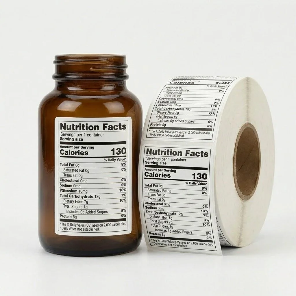
2. The Font “Safe Zone” and Legibility Standard
On a 27-inch monitor, tiny script fonts look elegant. But in the physical world, we deal with a phenomenon called “Ink Gain.” When liquid ink hits a substrate—whether it’s BOPP film or textured paper—it spreads slightly. This is where most DIY designs fail.
The “Canva Font Red/Black List”
As a factory owner, I’ve developed a mental “Black List” of fonts that fail on the production line. Avoid “Light” or “Ultra-Thin” versions of fonts like Playfair Display or Brittany Script for your fine print.
The thin lines often fall below the 0.25 pt (0.08mm) minimum stroke width, causing them to disappear or “break” during the printing process.
The Numerical Standards:
- Positive Text (Dark on Light): Never go below 4.5 pt.
- Reverse Text (White on Dark): Never go below 6 pt and bold.
Why the difference? In reverse printing, the surrounding ink tends to “bleed” into the white space of the letters. If your font is too thin, the ink will literally swallow the text. Jenn David Connolly, a leading food packaging expert, rightly points out that “accessibility is the new luxury.”
If your customers need a magnifying glass to read your “Instructions for Use,” you aren’t just losing style points; you’re losing market share and risking compliance issues.
3. The “10x Digital Loupe” and Transparency Flattening
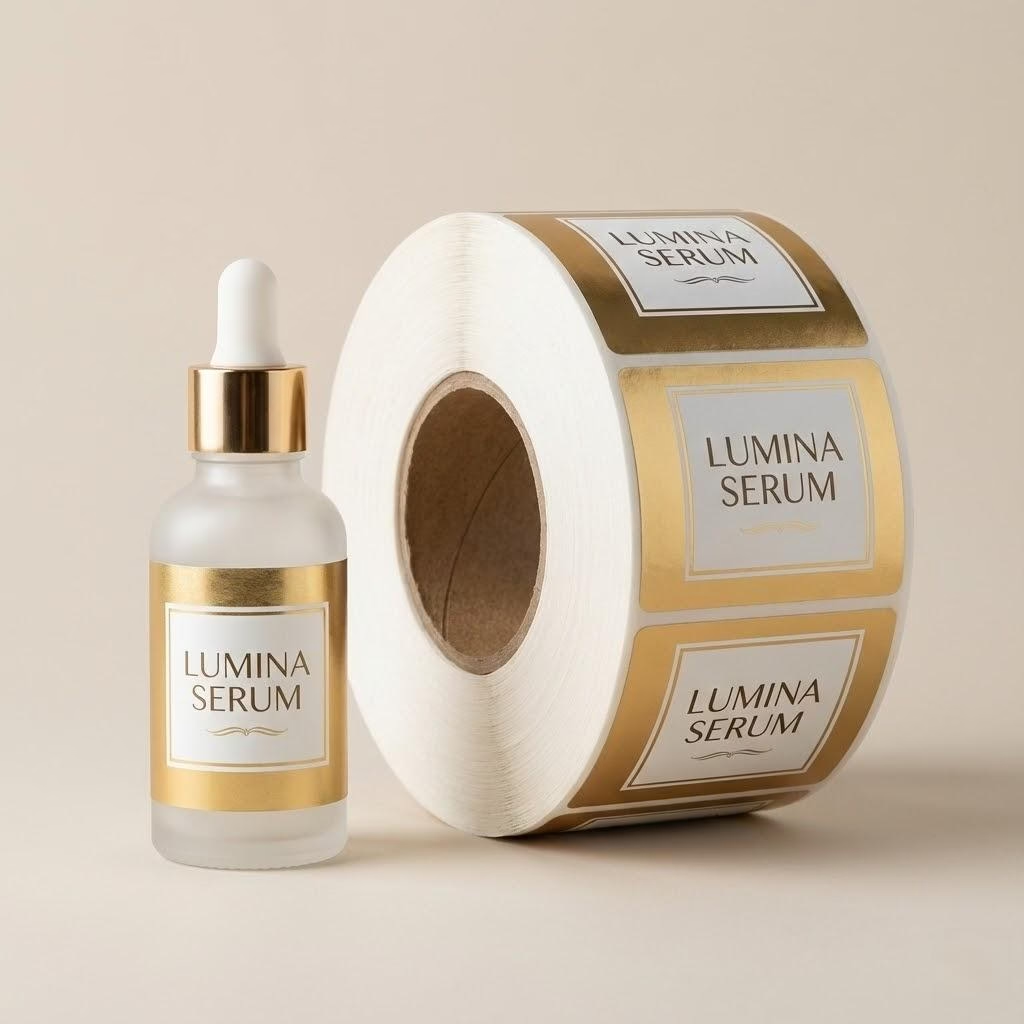
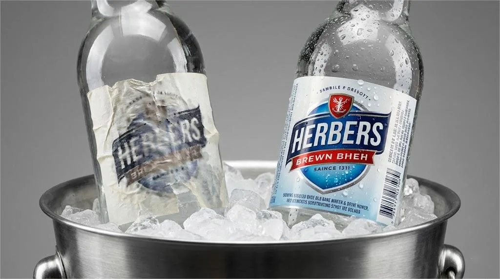
One of the most expensive traps in Canva is the “Transparency Glitch.” Last year, a client producing high-end organic serums sent us a file that looked stunning—lots of soft shadows and semi-transparent layers. He followed the online tutorials and exported it as a “PDF Print” file.
The Trap: Canva handles transparency by layering data, but industrial RIP (Raster Image Processor) software often struggles to interpret these layers. In this client’s case, the shadows printed as ugly, jagged “staircase” blocks, looking like a low-res photo from twenty years ago.
The Factory Solution:
At Label Printing China, we caught this using what I call the 10x Digital Loupe test. Open your exported PDF in a browser like Chrome and zoom in to 1000%. If you see “halos” or fuzzy artifacts around your transparent elements, the press will print them.
To fix this, use the “Flatten PDF” option in Canva’s export settings. This merges the layers into a single high-resolution image, ensuring the press sees exactly what you see. However, be warned: flattening can sometimes soften the edges of your text.
For the ultimate “Label Printing China Standard” of quality, we recommend a “vector layering” approach—keep your text on top and only flatten the background elements.
Ready to Scale Your Packaging Quality?
Don’t let technical errors hold your brand back. Discover how our machine-ready labels ensure your designs translate perfectly from Canva to the physical shelf.
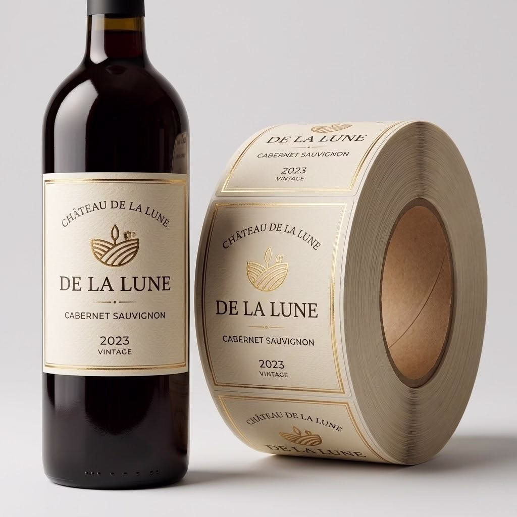
4. The Rich Black Secret (C40 M30 Y30 K100)
If your brand identity relies on a deep, luxurious black background, you might be disappointed when your labels arrive looking like a dusty charcoal gray. This happens because Canva’s default black is often “Single Black” (K100).
To achieve that “Sephora-level” obsidian finish, you need Rich Black. In our factory, we recommend a formula of C40 M30 Y30 K100. By layering cyan, magenta, and yellow under the black ink, the color gains “body” and saturation.
The “Trapping” Risk:
Here is a high-level insight you won’t find in a Canva tutorial: Never use Rich Black for fonts smaller than 6 pt.
Because the press must align four separate plates (C, M, Y, and K) perfectly to create that black, even a microscopic physical shift (less than the width of a human hair) will cause your small text to have a “ghosting” or blurry effect.
For fine print and barcodes, always stick to 100% Single Black. It is the only way to guarantee a crisp, scanable result for high-speed automated labeling lines running at 300+ BPM.
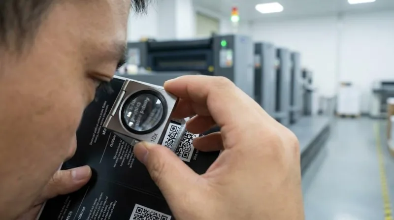
5. The 400% Stress Test and Material Physics

Your screen is a liar. It uses light (RGB) to hide imperfections. A printing press uses physical dots of ink (CMYK) that reveal everything. To bridge this gap, you must perform a 400% Stress Test.
Open your final PDF and zoom to 400%. This magnification simulates the “vision” of a 2400 DPI industrial press. If your logo looks even slightly fuzzy at 400%, it will definitely be blurry on your labels.
The Substrate Factor:
The material you choose is the final “filter” for your design. Choosing the wrong material can lead to high-cost production batch fails.
- Uncoated/Textured Paper: Great for “organic” vibes, but the ink spreads more. You need even higher contrast and larger fonts.
- BOPP/Film: Allows for the highest resolution and detail. If your design has complex Canva elements, this is your safest bet.
Industrial Specifications for High-Resolution Canva Labels
| Feature | Factory Standard | Why It Matters |
|---|---|---|
| Minimum Resolution | 300 DPI (Source) | Prevents pixelation on hand-held items. |
| Min Font Size | 4.5 pt (Pos) / 6 pt (Rev) | Stops ink from “filling in” letters. |
| Min Line Weight | 0.25 pt (0.08mm) | Ensures fine lines don’t break on press. |
| Black Background | C40 M30 Y30 K100 | Provides a premium, “Rich Black” finish. |
| Digital Check | 400% Zoom Test | Simulates industrial press sensitivity. |
The Bottom Line: From DIY to Factory-Ready
Scaling a brand requires you to be a visionary, but it also requires you to respect the technical limits of your supply chain. Moving beyond the frustration of blurry Canva labels isn’t about switching to expensive software; it’s about applying a factory owner’s mindset to your export process.
At Label Printing China, we believe that professional packaging should be accessible to every founder.
Before starting a large-scale project, always perform a comprehensive cost analysis to avoid hidden waste.
If you are preparing for a major production run and feel uncertain about your file quality, don’t leave it to chance.
Our Offer to Scaling Founders:
Send us your Canva-exported PDF today for a Free Factory Clarity Audit. We will run your file through our professional pre-press software to identify “fuzzy” assets, font risks, and transparency traps before you spend a single dollar on production.
Your product is world-class. It’s time your labels looked the part. Let’s build something sharp together.