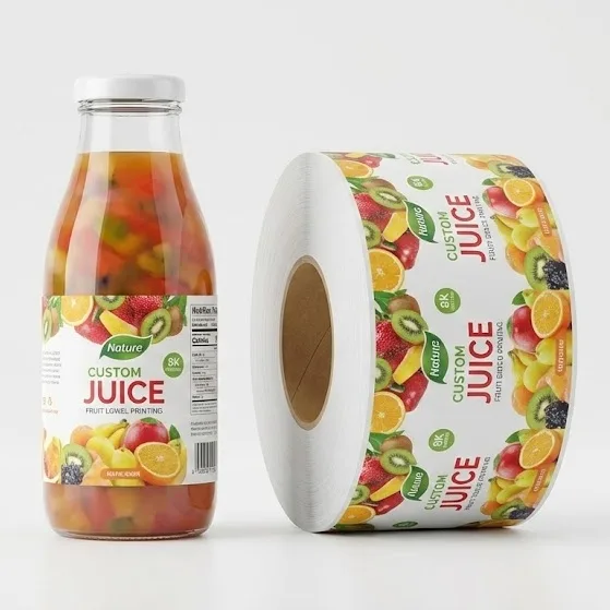
Are your beautifully designed custom labels arriving with blurry text and missing lines? You’re not alone. I am going to show you exactly why tiny fonts and hairlines disappear during mass production, and the exact pre-press engineering steps you need to fix this costly problem for good.
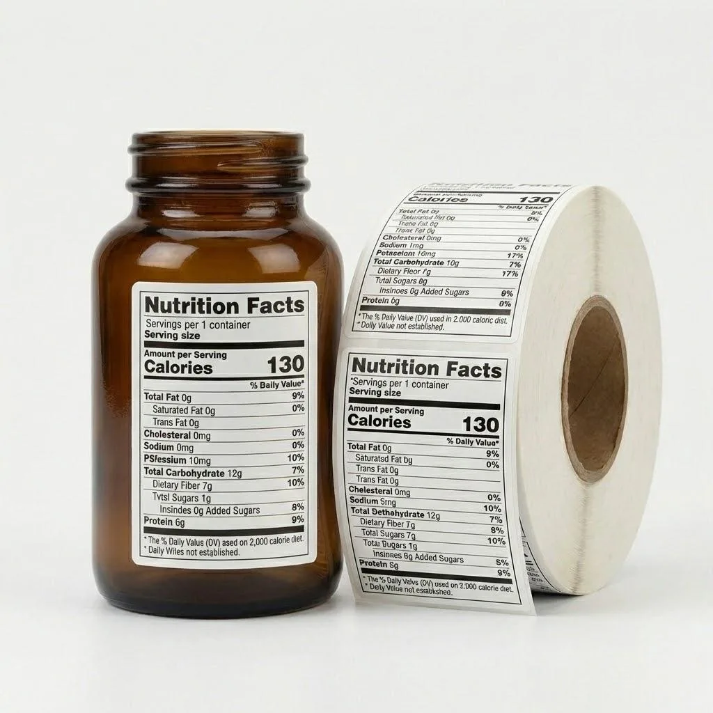
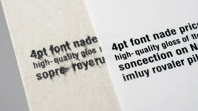
Tiny fonts and hairlines disappear in mass label printing due to physical plate washout and uncontrolled dot gain. If positive lines fall below 0.25pt or text is under 4pt, the printing plates cannot hold the fine details, causing elements to wash away or blur completely on the press.
However, simply adjusting your font size in Illustrator is not enough to solve the root of the problem. Keep reading to discover the exact material science secrets and pre-press auditing checklists that guarantee your packaging arrives 100% machine-ready.
Why Software Settings Fail

In the realm of digital design, a 0.1pt line is perfectly visible on a retina display. However, Adobe Illustrator operates in a frictionless, digital vacuum. Industrial label manufacturing operates in the physical world, governed by fluid dynamics, mechanical pressure, and chemical reactions.
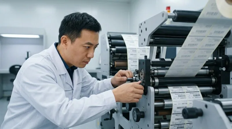
When procurement teams send identical PDF files to multiple suppliers, they often assume the output will be identical. They treat label converters as simple “ink on paper” printers. This assumption ignores the critical transition phase between a digital file and a physical printing press: Pre-press Engineering.
“Graphic design creates the vision, but pre-press engineering secures the reality. In mass packaging production, file preparation is not just about aesthetics; it is a highly technical translation process. Without proper trapping, step-and-repeat optimization, and dot gain compensation, even the most beautiful on-screen designs will fail on the printing press.”
— Jan De Roeck, Director of Marketing, Industry Relations & Strategy at Esko.
If your supplier simply takes your PDF and sends it straight to the platemaker without mathematically adjusting the artwork for the specific press conditions, your fine details are guaranteed to fail.
It’s Not Just Your Design
To understand why hairlines disappear, you must look at how photopolymer printing plates are manufactured.
In flexographic printing, the image is raised on a flexible polymer plate, much like a traditional rubber stamp. During the platemaking process, the plate undergoes high-pressure water or solvent washing to carve out the non-image areas.
Here is the harsh physical truth: If a line is too thin, its polymer base cannot withstand the aggressive washout process. A 0.1pt line does not simply print faintly; its physical structure snaps off and is washed down the drain before the plate ever reaches the press. Consequently, that specific detail vanishes entirely from the final label.
To prevent plate washout, strict adherence to minimum tolerances is non-negotiable.
Core Decision Points for Minimum Tolerances
- Positive Lines (Dark ink on light background): Never drop below 0.25 pt (approx. 0.088 mm).
- Reverse Lines (Light/white lines cutting through dark ink): Never drop below 0.50 pt (approx. 0.176 mm). The surrounding ink will naturally expand and swallow anything thinner.
- Positive Text: Minimum safe size is 4 pt.
- Reverse Text: Minimum safe size is 6 pt.
The Flexographic Technical Association (FTA), through its FIRST (Flexographic Image Reproduction Specifications & Tolerances) global industry standards, mandates these exact minimums. They warn that typography smaller than 4 point carries a severe risk of filling in entirely due to ink spread and mechanical registration tolerances on high-speed web presses.
The “Rich Black” Trap and High-Speed Registration Shift
One of the most catastrophic errors in packaging design is utilizing “Rich Black” for tiny text. Rich black is a color mixture (for example, Cyan 60%, Magenta 40%, Yellow 40%, Black 100%) designed to create a deep, luxurious dark tone.
While this looks spectacular in large background blocks, it is lethal for fine typography. Industrial web presses run at extraordinary speeds. Even the most advanced machinery possesses a mechanical registration shift—usually between ±0.05 mm and ±0.1 mm. This means the different color stations (Cyan, Magenta, Yellow, Black) might shift infinitesimally as the substrate webs through the machine.
If your 4pt ingredient list is printed using four overlapping colors, a 0.05 mm shift will cause the colors to misalign. The result is severe multi-color ghosting, rendering the text blurry and completely unreadable.
Any typography smaller than 8 pt must be strictly converted to 100% Single-Color Black (100% K) in the pre-press stage. Furthermore, a Master Printing Engineer will apply Trapping—a microscopic overlapping of adjacent colors (usually 0.05 mm to 0.1 mm) to ensure no white gaps appear during high-speed production.
How Different Substrates Absorb Hairline Inks
Perhaps the most overlooked factor in label legibility is the surface energy of the substrate itself. Using a single master PDF across a diverse product range—applying the same file to glossy films, textured papers, and metallic foils—will inevitably lead to failure.
This introduces the concept of Dot Gain (Tonal Value Increase). When liquid ink transfers from the anilox roller to the printing plate, and finally is pressed onto the material, the ink dot naturally expands.
| Substrate Type | Surface Characteristics | Avg. Dot Gain | Legibility Risk |
|---|---|---|---|
| BOPP Film | High surface energy, smooth | 10% – 15% | Low |
| Matte PE Film | Low surface energy, porous | 20% – 25% | High |
| Kraft Paper | Rough, high capillary action | 30% + | Critical |
TL;DR: If your priority is fine detail, choose BOPP films; if you face harsh wicking on paper, invest in custom prepress compensation.
“In flexography, dot gain is not a defect; it is a fundamental physical reality of the process… Fine reverse lines and tiny positive dots are the first casualties if this mechanical expansion isn’t mathematically compensated for before the plates are ever made.”
— Dr. Malcolm Keif, Professor in the Graphic Communication Department at California Polytechnic State University (Cal Poly).
Ready to Secure Your Production Line?
Eliminate the risk of blurry text and production alarms with our engineer-led pre-press audit. Get machine-ready labels tailored to your specific substrate.
The “100% Machine-Ready” Mandate
Solving the physical constraints of plate washout and dot gain ensures your labels are visually perfect. However, in B2B procurement, a label that looks good but fails on the production line is still a defective product. When your procurement strategy focuses purely on the lowest cost-per-piece, you expose your operations to the catastrophic hidden costs of automation failure.
A health brand switched to clear BOPP on a clear PET liner for an “invisible” look. The labels were sharp, but their high-speed labelling technology could not detect the divide between clear on clear, causing the line to crash. Downtime costs reached $5,000 per hour. We intervened by printing high-contrast black timing marks on the liner and micro-calibrating release force. Our Machine-Ready Label Manufacturing protocols saved the production cycle.
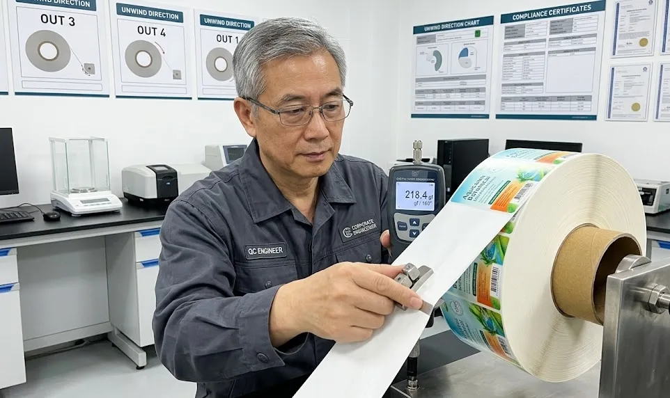
The Ultimate Pre-Press Audit Checklist for Procurement Managers
To truly protect your margins and ensure a seamless global supply chain, you must transition from a passive buyer to an active technical auditor. Before finalizing any mass label printing contract, demand that your supplier provides concrete answers to the following engineering checkpoints:
-
- Substrate-Specific TVA Calibration: Do you apply universal dot gain compensation, or do you utilize specific TVA curves customized for the exact surface energy and capillary action of my chosen material?
- Mechanical Trapping Protocols: Does your pre-press team automatically execute 0.05mm – 0.1mm trapping for all adjacent color blocks to prevent registration shift gaps?
- Small Typography Protection: Do you actively audit and convert all multi-color text below 8pt into 100% single-color black before platemaking?
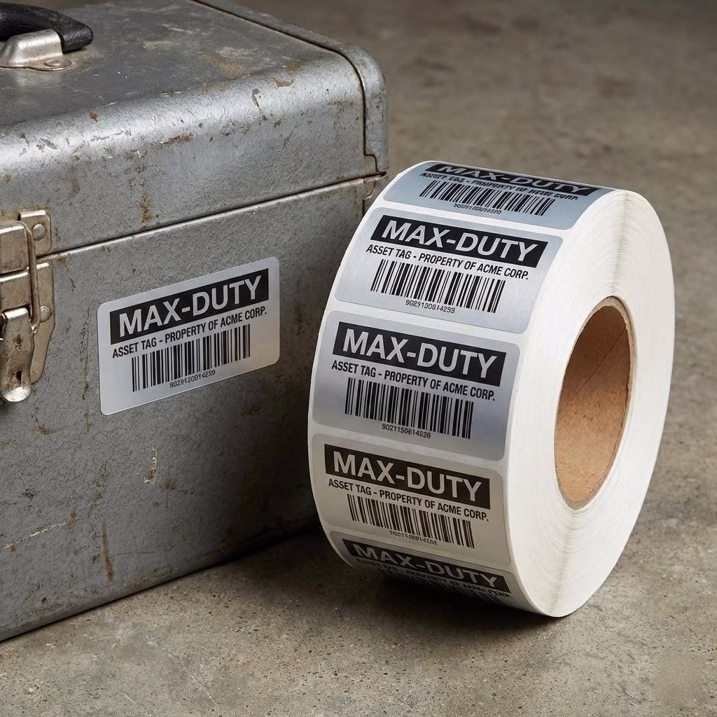
- Barcode Decodability Standards: Do you mathematically verify the contrast ratios and guarantee a minimum 2.5 mm quiet zone for all scannable elements?
- Applicator Integration Audit: Before production, do you verify our required unwind direction, core size, liner release force, and gap sensor compatibility?
If a vendor cannot confidently address these parameters, they are merely passing your PDF through a printer, leaving you entirely exposed to the risks of plate washout, ink spread, and mechanical downtime.
The persistent problem of tiny fonts and hairlines disappearing is a symptom of a much larger issue: the disconnect between digital intent and industrial reality. By demanding rigorous pre-press engineering, acknowledging the physics of materials, and enforcing strict machine-ready audits, you eliminate the opaque risks of overseas procurement. Backed by 18 years of China manufacturing experience, we do not just print labels; we engineer certainty.
We ensure that you truly save 30% without ever sacrificing the uncompromising standard of being 100% machine-ready.