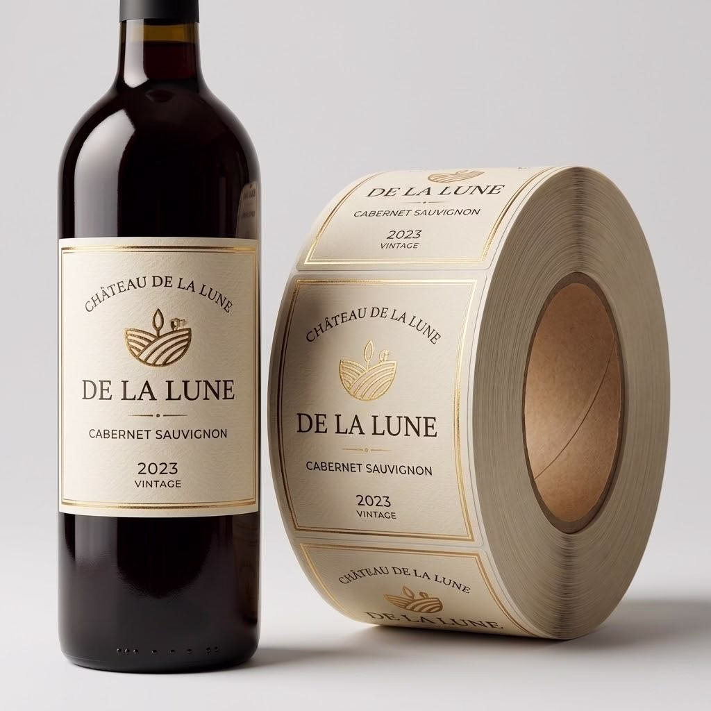
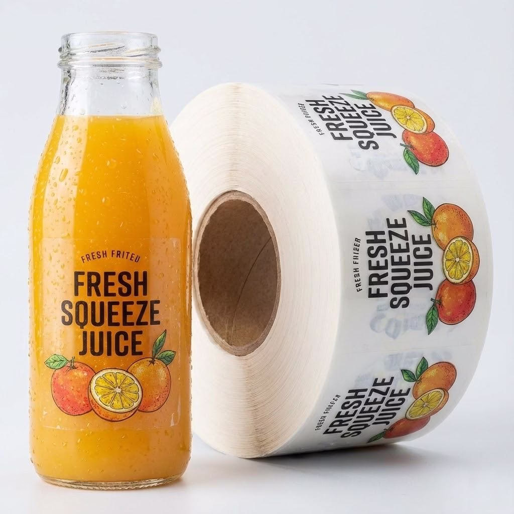
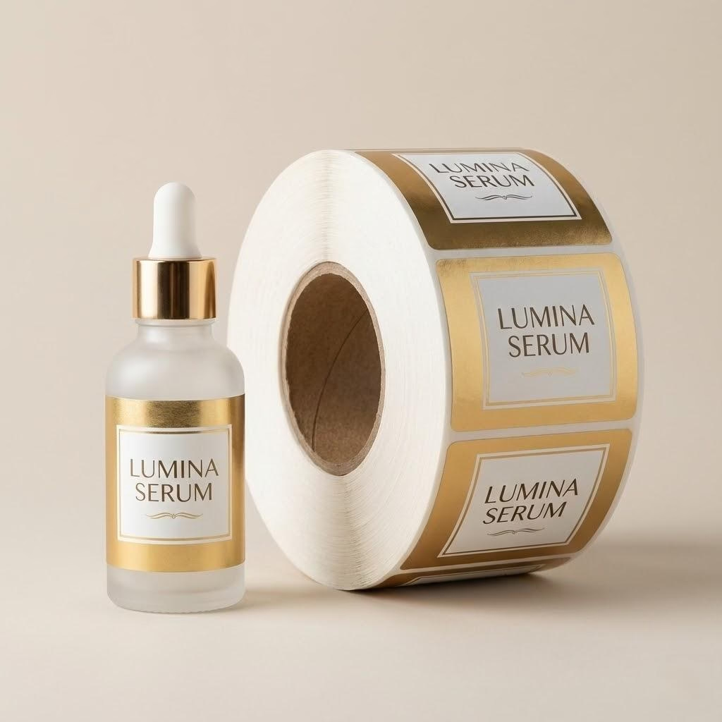
Are you panicking because your mass-produced roll labels don’t perfectly match your digital proofs? You are not alone, and it is rarely a manufacturer defect. Discover the exact industrial reasons behind this visual gap and how to scientifically manage your procurement expectations.
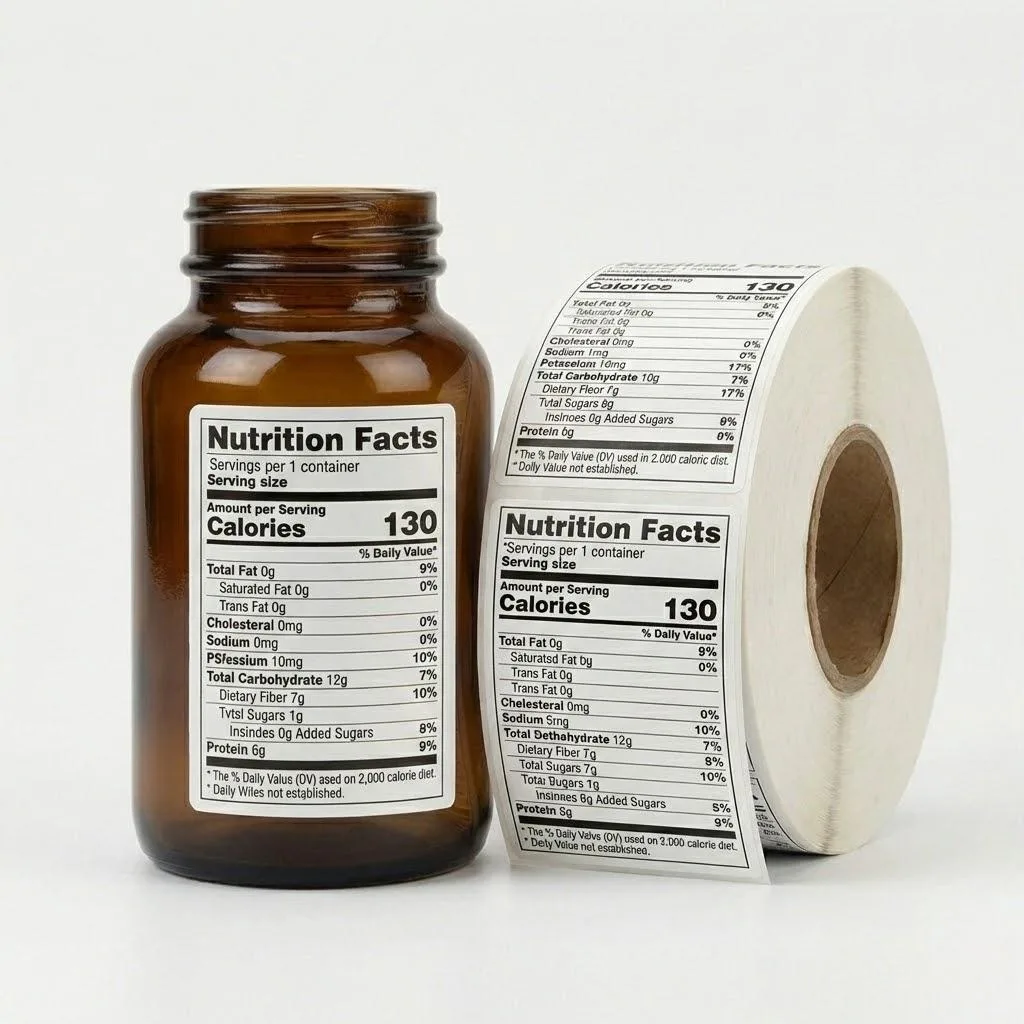
Labels look different from samples due to the physics of high-speed commercial printing. While digital proofs are created slowly at room temperature, mass production involves intense mechanical pressure and heat. This causes a natural dot gain, making final colors appear slightly darker.
Want to know how to stop this natural variance from jamming your automated labeling machines? Keep reading to uncover the exact engineering parameters you must demand from your supplier.
The Physics of High-Speed Press vs. Static Proofing
Imagine your label design is a perfect digital master. On your monitor, the colors are vibrant, and the lines are razor-sharp. When you receive a digital proof or a small-batch sample, it likely matches that screen perfectly because it was produced on a slow-fed, cold-process inkjet printer.
But when we move to mass production—running 100,000 units on an industrial rotary press—the physics fundamentally change. This is why our label materials guide emphasizes that physical substrates react differently under industrial stress.
In a high-speed manufacturing environment, labels move through the press at speeds exceeding 100 meters per minute. This speed creates intense mechanical pressure and heat accumulation within the cylinders. This heat directly impacts the ink rheology, causing what engineers call dot gain or Tonal Value Increase (TVI).
As the ink hits the substrate at high velocity under pressure, the halftone dots physically expand. In professional flexography, a 15% to 20% dot gain is a documented physical reality. This is why your mass-produced labels may appear slightly “heavier” or darker than a static sample.
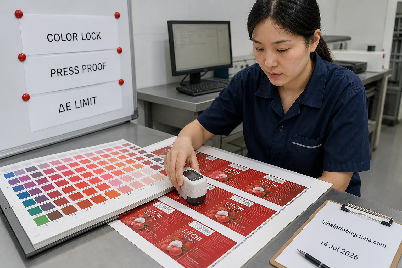
To move beyond subjective “eye-balling,” we utilize the Delta E formula to manage these industrial tolerances:
ΔE = √ [ (L1 – L2)² + (a1 – a2)² + (b1 – b2)² ]
Known as the CIE76 color difference formula, this equation calculates the visual difference (the “Euclidean distance”) between two colors within the CIELAB color space.
- ΔE (Delta E): Represents the total color difference. A lower value indicates a closer match, while a higher value means the discrepancy is more perceptible to the human eye.
- L: Represents Lightness, ranging from 0 (pure black) to 100 (pure white).
- a: Represents the green-red axis (positive values indicate red, negative values indicate green).
- b: Represents the blue-yellow axis (positive values indicate yellow, negative values indicate blue).
Note: The subscripts 1 and 2 denote the two specific colors being compared (e.g., the client’s approved digital standard vs. the factory’s actual printed mass production sample).
“A perfect match between different devices is scientifically impossible due to varying color gamuts and substrates. Establishing numerical, acceptable industrial tolerances using Delta E measurements is the only viable path for commercial manufacturing.” — Dr. Abhay Sharma, Professor at Toronto Metropolitan University
Production Variables Comparison
| Production Variable | Prepress Proofing | High-Speed Rotary | Impact on Final Label |
|---|---|---|---|
| Speed | < 1 meter/min | 100+ meters/min | Increases ink spread. |
| Pressure | Minimal/Zero | High Cylinder Impression | Triggers 15-20% dot gain. |
| Heat | Ambient/Low | Intense UV/LED Curing | Alters ink viscosity. |
TL;DR: If your priority is absolute color precision, choose digital proofing for approval; if you face high-volume needs, manage expectations with a Delta E allowance.
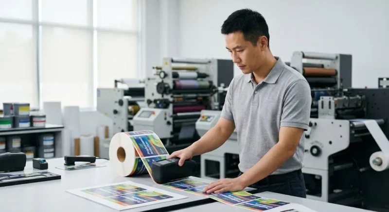
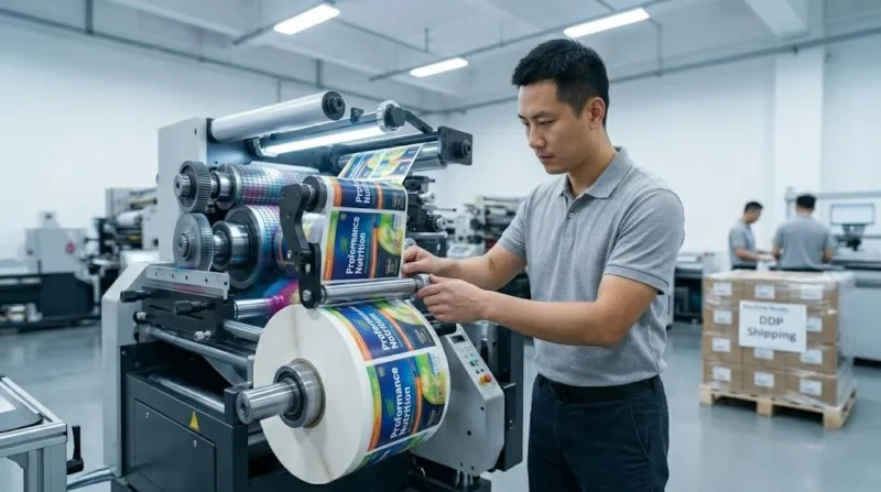
Engineering Trade-off for Machine-Ready Rolls
A few years ago, a prominent US supplement brand switched to a supplier who promised a 100% visual match to their digital proof. The 10 samples they received were stunning. However, when the 200,000-label bulk order arrived, their 400-bottle-per-minute labeling line ground to a halt.
The supplier had prioritized “neatness” by over-tightening the rewind tension to make the rolls look flat, but this squeezed the adhesive out of the edges (adhesive bleed) during transit. The resulting downtime cost the brand over $15,000 in lost production in just two days.
We intervened by re-engineering the roll with a high-tensile glassine liner and locking the release force at 25g-30g/25mm, allowing the line to run flawlessly. This is why reviewing a relevant industrial label case study is vital before committing to bulk production.
This case highlights a critical truth: focusing solely on aesthetics can destroy your Production Security. A label that looks beautiful on your desk is a liability if it causes machine downtime. You must calculate the hidden risks using the Downtime Cost Formula:
Downtime Cost = (Labor Cost per Hour + Lost Production Value per Hour) × Hours Lost
To ensure your labels are 100% Machine-Ready, we leverage our 18 years of technical expertise to balance visual quality with mechanical performance. This involves identifying potential adhesive bleed risks before they hit your applicator. This involves:
- Precision Release Force: Calibrating the peel-off resistance specifically for your machine speed.
- Tension Tolerance: Restricting web tension variance to ±5% to prevent adhesive bleed.
- Liner Integrity: Selecting the right carrier (PET vs. Glassine) based on your application velocity.
Ready to Achieve 100% Machine-Ready Excellence?
Stop risking your production line with “sample-focused” suppliers. Get factory-direct labels engineered for high-speed automation and industrial durability.
Environmental Shifts in Global Supply Chains
If you are sourcing labels from China to achieve 30% savings, you must account for the “Global Logistics Micro-climate.” Your samples travel via air-conditioned courier, but your mass production spends weeks in a shipping container. In the middle of the Pacific, container temperatures can hit 60°C (140°F) with 90% humidity.
This extreme environment causes “material evolution.” Paper substrates can experience a 0.5% to 1.0% physical scale change due to moisture absorption. High heat can also cause “post-curing” of UV varnishes, subtly shifting the gloss level by 3% to 5%.
Buyer’s Playbook for Industrial Tolerances
To avoid internal “finger-pointing” between your design and production teams, follow this professional SOP. Referencing established barcode label standards can further streamline your quality control process:
- Define Numerical Tolerances: Require your supplier to document color within a ΔE ≤ 3.0 range.
- Audit Pre-Press Data: Ensure the factory uses ICC profiles that specifically compensate for the 15-20% dot gain of their specific rotary presses.
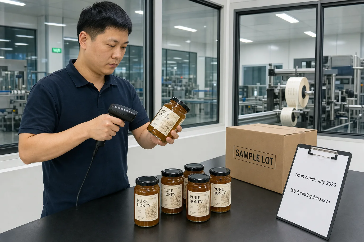
- Mandate Machine Specs: Your Purchase Order should specify the required Release Force (g/25mm) and ANSI Grade (A or B) for barcode readability.
- Logistics Protection: Demand pallets be wrapped in industrial moisture barriers to stabilize the material’s dimensional integrity during sea transit.
Cost Transparency
Achieving significant savings doesn’t mean compromising on quality; it means understanding where the costs—and risks—actually live. By acknowledging the science behind the “sample gap,” you move from being a “buyer of stickers” to a “manager of industrial assets.”
The ultimate goal of procurement is not just lower unit prices, but the elimination of hidden downtime costs through industrial precision.