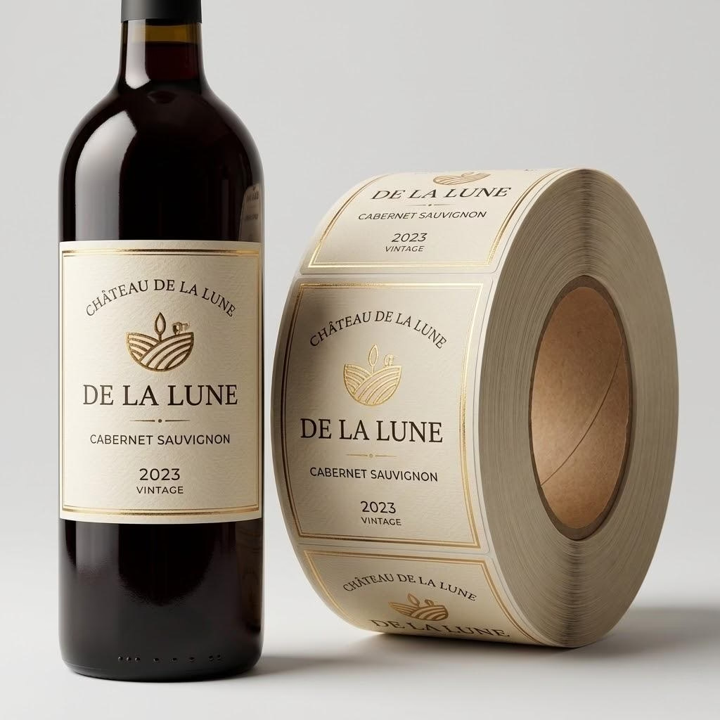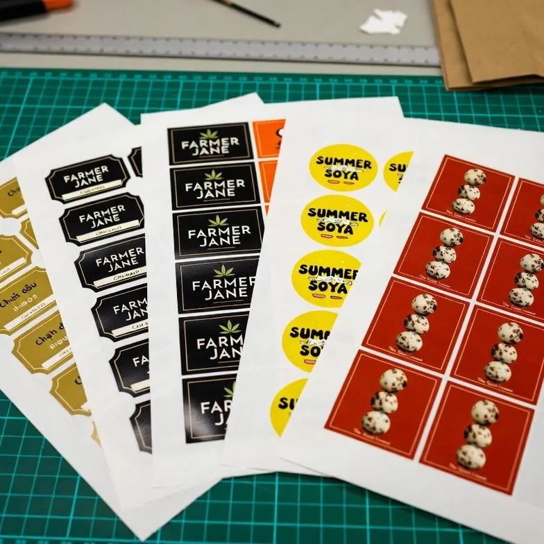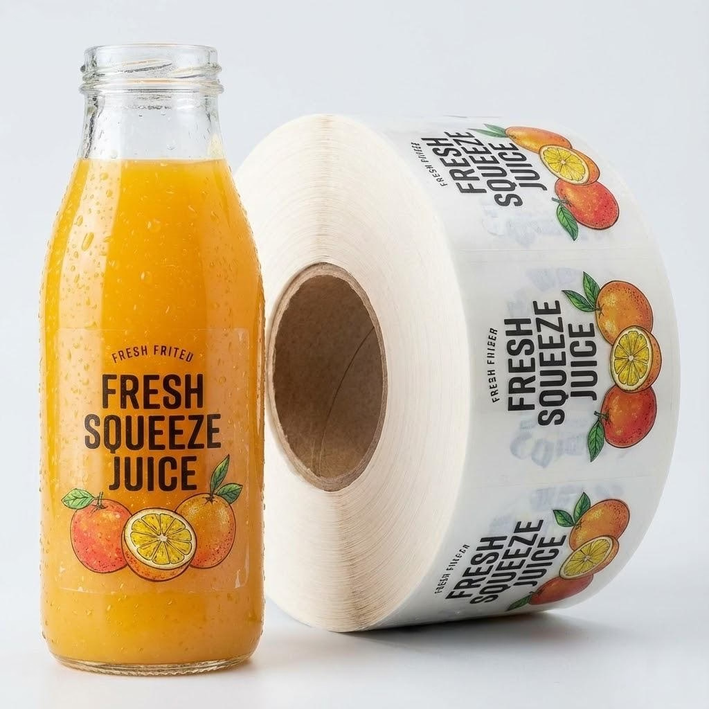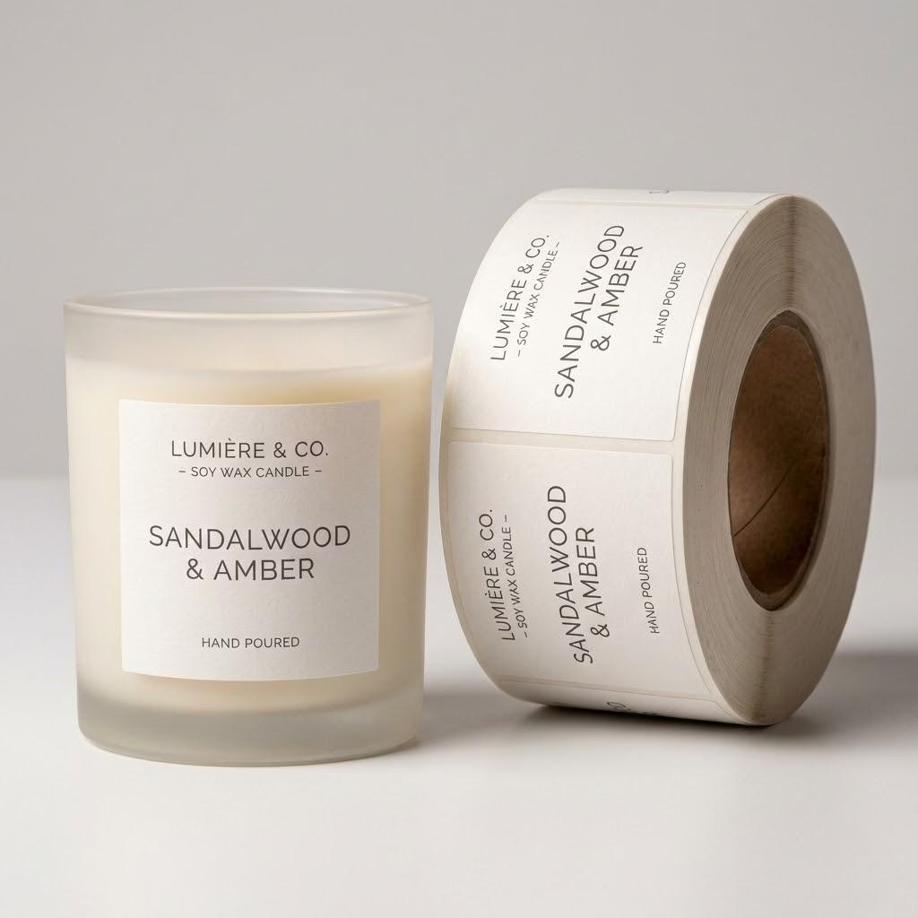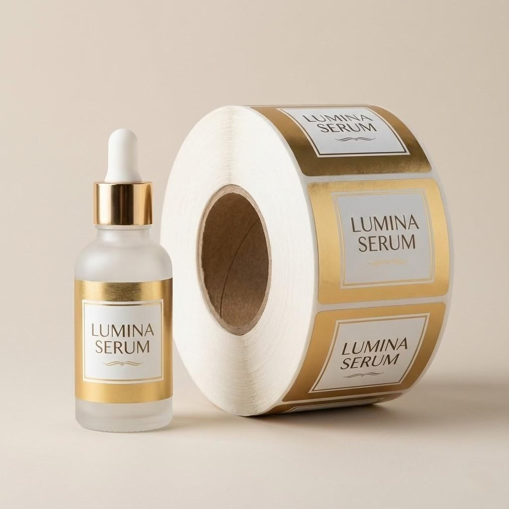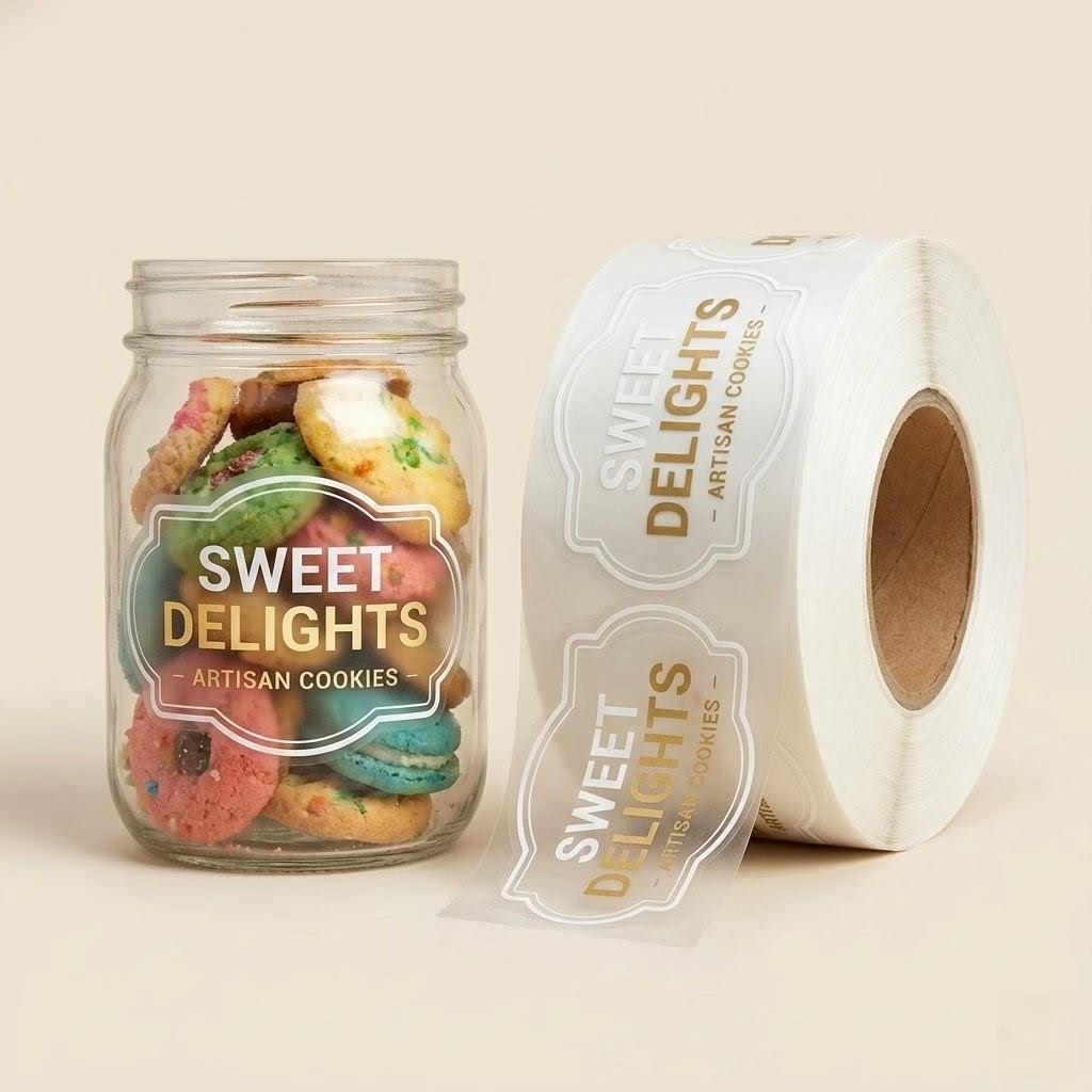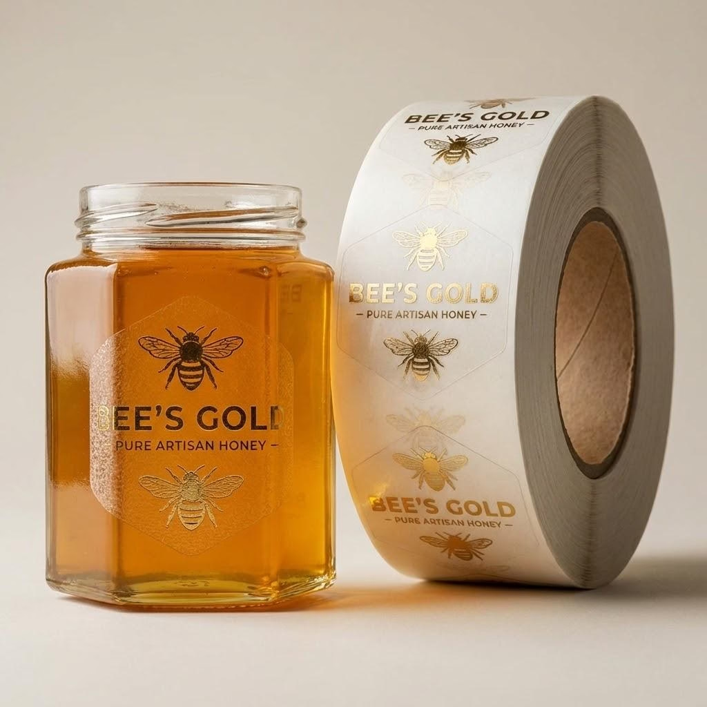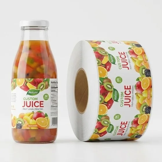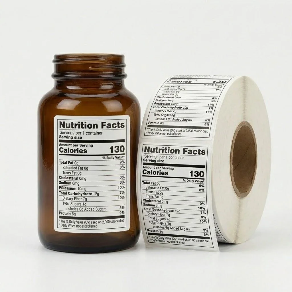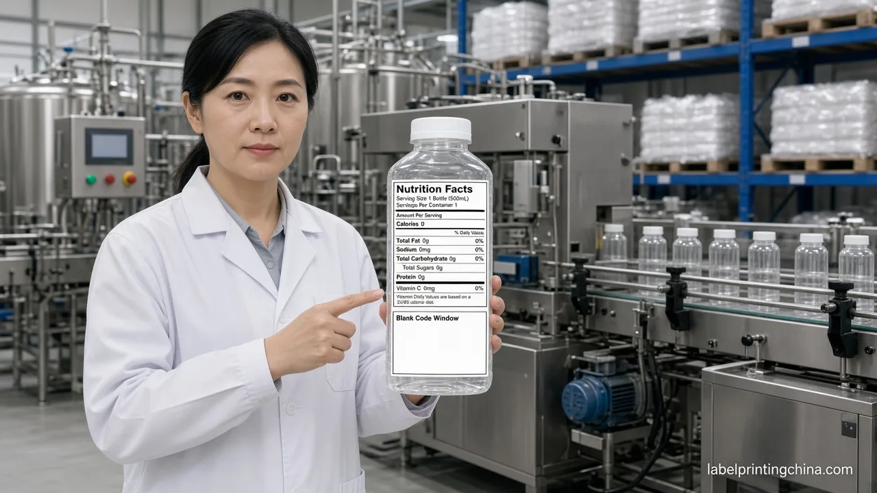
A retail-ready beverage label wins at three meters first.Use one dominant brand color with enough contrast against typical shelf backgrounds, keep typography to three clear lines, and match finish (matte, gloss, foil, or texture) to how the bottle is stored and handled. Small brands that skip a physical shelf test often discover readability problems only after 500 labels are printed.
Craft breweries, cold-pressed juice lines, functional teas, and energy drinks all compete in the same refrigerated case or ambient aisle. Shoppers rarely read paragraphs on a bottle. They scan color blocks, recognize a flavor cue, and decide in seconds whether the product looks credible next to national brands.
This guide turns beverage label design into practical drink label design tips you can use before sending artwork to a factory.It covers shelf contrast, type hierarchy, finish combinations, five real category patterns, and a Canva-to-factory file checklist. If you are sourcing custom beverage labels or scaling from farmers market to retail, the goal is one decision: make the label readable, durable, and printable without a costly reprint.
Why Beverage Label Design Fails on Retail Shelves
Most label failures on shelf are design problems, not printing problems. The artwork looked strong on a laptop screen at 100% zoom. On a crowded shelf, under fluorescent or LED lighting, beside darker competitors, the same label can disappear.
Common failure patterns include low contrast between brand color and background, too many font styles, regulatory text smaller than the store will accept, and finishes that glare under retail lights. Another frequent issue is designing for social media square crops instead of a curved bottle wrap.
Small brands also underestimate handling. A shopper picks up a cold bottle, leaves fingerprints on gloss film, and puts it back. If the label scuffs or the ink rubs, the product looks used. The internal guide on labels under retail lighting explains how finish choice affects that first impression.
Based on 18 years of technical expertise in beverage converting, Label Printing China sees the same correction request after a weak shelf test: simplify the front panel, enlarge the flavor line, and increase contrast before adding more decoration.
Color Contrast That Reads at Three Meters
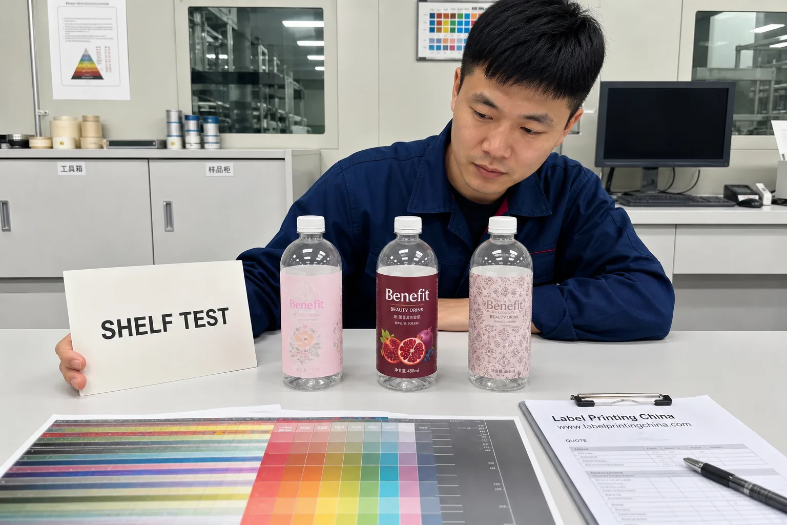
Retail buyers and distributors often evaluate new drinks from arm’s length, but shoppers decide from farther away. A useful internal standard is the three-meter test: stand back, squint slightly, and ask whether you can still name the brand and flavor.
Contrast is not only light versus dark. It is the relationship between your dominant brand field and the average color of nearby packages. A soft pastel may look elegant in a mood board and vanish next to dark glass, black cans, or high-saturation energy drinks.
| Shelf Context | Safer Design Move | Risk Signal |
|---|---|---|
| Refrigerated juice or tea case | One saturated hero color plus white type | Pastel-on-pastel flavor lines |
| Craft beer or cider aisle | Dark base with metallic or cream accent | Busy illustration with no color block |
| Premium water or functional drink | Minimal palette, strong single word mark | Thin hairline logos on clear bottles |
| Energy and sports drinks | High-chroma accent with black regulatory band | Neon gradients without solid anchor |
Before finalizing artwork, print a laser proof at label size and tape it to the bottle. Photograph it on the shelf or in a case mock-up. If the flavor name is not obvious in that photo, increase size or contrast before you order custom juice bottle labels or other beverage runs.
Typography Hierarchy for Drink Labels
Typography carries flavor, credibility, and compliance at the same time. The safest hierarchy for small brands is three lines on the front panel: brand name, flavor or variant, and one proof point such as organic, zero sugar, or region.
Keep decorative scripts off the nutrition panel and bar code zone. Regulatory text should use a clean sans serif with predictable x-height. Many retailers expect allergen and net quantity information to remain legible without magnification.
Avoid mixing more than two font families. One display face for the brand and one workhorse sans for everything else is enough for most craft beverages. If you need premium cues on wine or spirits, reserve serif or script solely for the brand wordmark, not for ingredient lists.
Buyer takeaway: If a shopper can read brand and flavor in under two seconds, the hierarchy is working. If they must rotate the bottle, the flavor line is too small or the background is too busy.
For multilingual or export labels, plan extra panel space early. Re-flowing English artwork into French or Spanish after print approval often breaks the shelf layout you tested.
Finish Combos That Signal Premium Without Overbuilding
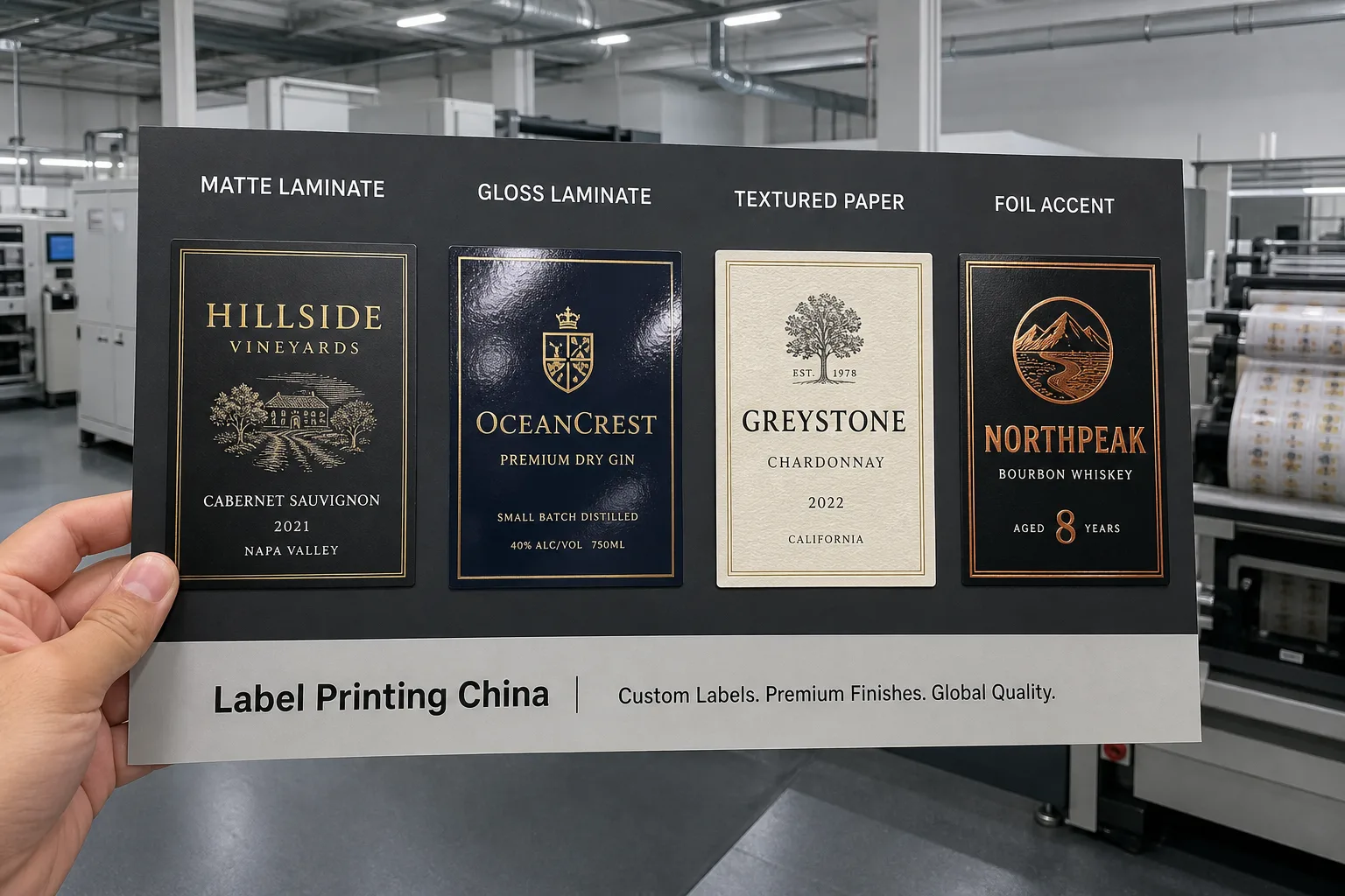
Finish is where many small brands overspend. Foil, emboss, soft-touch varnish, and high-gloss laminate each send a signal. Together without a plan, they can make a 12-ounce craft soda look over-designed or hard to print at MOQ 500.
Match finish to storage and handling first, then to brand positioning. Refrigerated drinks need moisture tolerance. Wine and spirits may prioritize tactile texture. Energy drinks often use gloss and metallic inks for shelf pop under bright lights.
| Finish Combo | Best For | Watch-Out |
|---|---|---|
| Matte laminate on BOPP | Juice, tea, kombucha, chilled functional drinks | Can look flat without a strong color block |
| Gloss laminate plus spot white | Clear bottles, energy drinks, enhanced water | Fingerprints and glare under spotlights |
| Textured paper plus lamination | Craft beer, premium cider, artisanal mixers | Not ideal for long wet refrigeration without edge seal |
| Foil stamp plus matte field | Wine, spirits, gift-season beverages | Raises cost and needs precise registration |
If the bottle will face condensation, pair decorative finishes with a practical base material. The guide on condensation-proof juice labels shows how face stock and adhesive matter as much as foil or emboss.
For custom wine label projects, texture can differentiate a small vineyard without loud color. For mass-retail energy drinks, gloss and metallic effects usually outperform soft-touch because the goal is distance readability, not hand-feel alone.
Design Patterns That Work
Category conventions exist because they reduce shopper confusion. You can break conventions, but you should do it deliberately. The table below summarizes patterns Label Printing China sees work for scaling beverage label orders.
| Category | Shelf Cue | Typical Material | Design Move |
|---|---|---|---|
| Wine | Heritage or region story | Textured paper, foil accent | Reserve foil for crest or vintage line only |
| Water | Purity and source | Clear BOPP on PET bottle | Minimal words, strong single icon |
| Juice | Flavor and freshness | White BOPP, matte or gloss laminate | Large flavor color block, fruit cue |
| Tea and kombucha | Wellness or craft story | Matte film or craft paper laminate | Earthy palette with one bright accent |
| Energy drinks | Power and performance | Gloss BOPP, metallic inks | Bold diagonal graphics, high contrast type |
Use category patterns as a starting point, not a cage. A kombucha brand entering Whole Foods still needs its own color story, but shoppers should instantly know which case to search.
From Canva Mockup to Print-Ready Factory Files
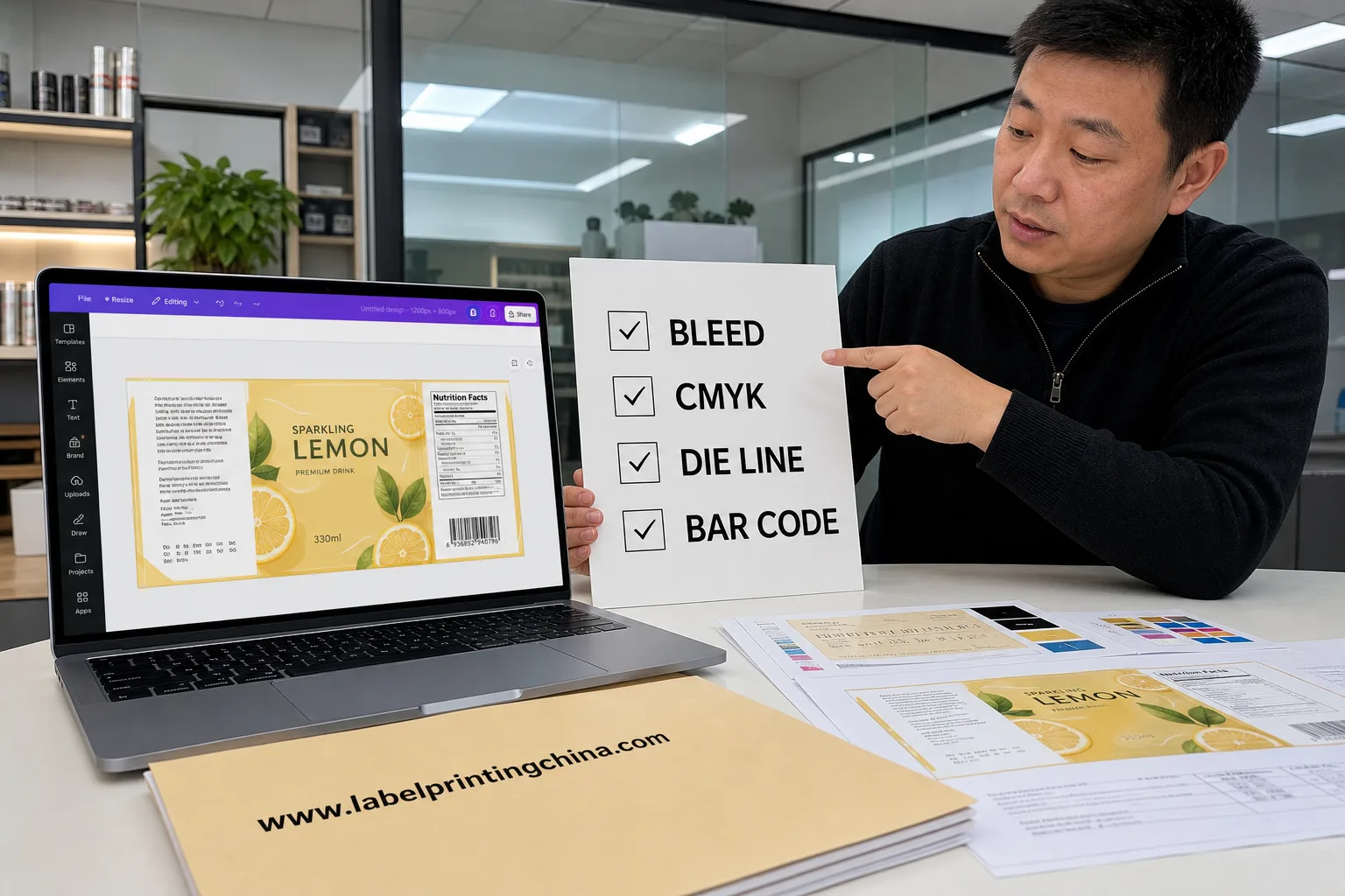
Canva is a practical tool for early layout and investor decks. Factories cannot print a PNG mockup alone. They need vector art, correct dimensions, bleed, die line, and color settings that match press requirements.
A typical small-brand workflow looks like this:
- Build layout and flavor system in Canva or similar tool.
- Export PDF for review and shelf photography mock-ups.
- Rebuild or convert critical text to outlined vector PDF or AI with factory template.
- Request a physical press proof on the target material.
- Approve only after shelf photo, bar code scan, and nutrition check.
The FDA notes that nutrition labeling rules apply to most beverages sold in the United States. Design files must leave room for compliant panels, not squeeze them in after artwork is finished.
If you are new to supplier workflows, the small brand label playbook covers MOQ, sampling, and roll specifications in more detail.
Pre-Press Design File Checklist Before You Order
Send this checklist with your RFQ to reduce back-and-forth and avoid a reprint. Label Printing China offers a free pre-press audit on most beverage projects; the audit is faster when files arrive complete.
| File Item | Requirement | Common Canva Gap |
|---|---|---|
| Artwork size | Exact label width and height with 3 mm bleed | Screen ratio only, no die size |
| Color mode | CMYK or named spot colors | RGB export shifts on press |
| Fonts | Outlined or embedded in PDF | Missing font substitution |
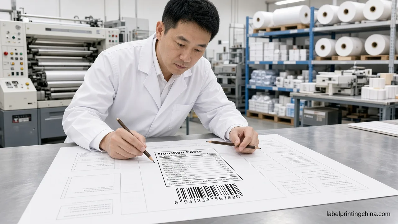
| Bar code | Vector UPC or EAN with quiet zone | Raster bar code that fails scan |
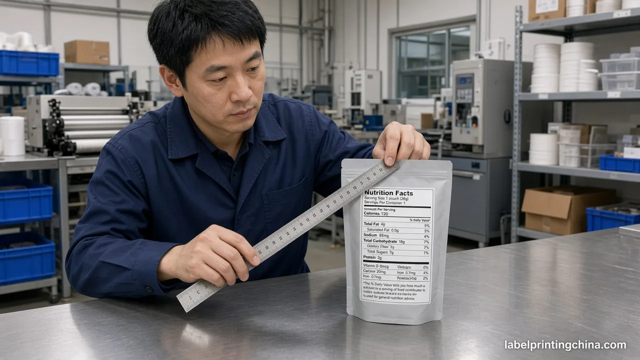
| Nutrition panel | Editable text, correct serving size | Flattened image panel |
| Die line | Separate layer, bottle curve confirmed | Rectangle export only |
| Finish callouts | Matte, gloss, foil noted on proof | Visual effect with no spec |
| Reference photo | Bottle photo with label position marked | Flat mock-up only |
When files pass this checklist, production moves faster and sample approval becomes a quality conversation instead of a rescue project.
RFQ Fields for Beverage Label Design Projects
Include quantity, bottle material, fill temperature, storage conditions, label application method, and target retail channel. A farmers market jar and a PET juice bottle for club retail need different adhesives, finishes, and panel layouts even if the brand color is the same.
MOQ 500 is realistic for many small beverage brands working with Label Printing China. Splitting too many SKUs in the first order often increases waste more than it saves cash. Plan one hero SKU for retail launch, then extend the flavor system after the shelf test passes.
Get Free Design File Check
Response in 12h · 30% Savings · Free Pre-Press Audit
Frequently Asked Questions
What makes a beverage label stand out on a retail shelf?
High contrast, a clear three-line hierarchy, and a finish that survives store lighting and handling. Test at three meters on the actual bottle before print approval.
Can I design drink labels in Canva and send them to a factory?
Yes, if you export vector PDF with outlined fonts, bleed, die line, and CMYK colors, then approve a physical proof on the target material.
How many colors should a small beverage brand use?
One dominant brand color, one accent, and dark regulatory text is enough for most craft drinks. Extra colors raise cost without improving shelf readability.
What label finishes work for refrigerated drinks?
Matte or gloss BOPP with lamination is common. Add foil only when the bottle environment is dry or lamination protects the decoration.
What files does a beverage label printer need?
Vector PDF or AI, CMYK or spot colors, bleed, die line, vector bar code, editable nutrition text, and a bottle reference photo showing label position.