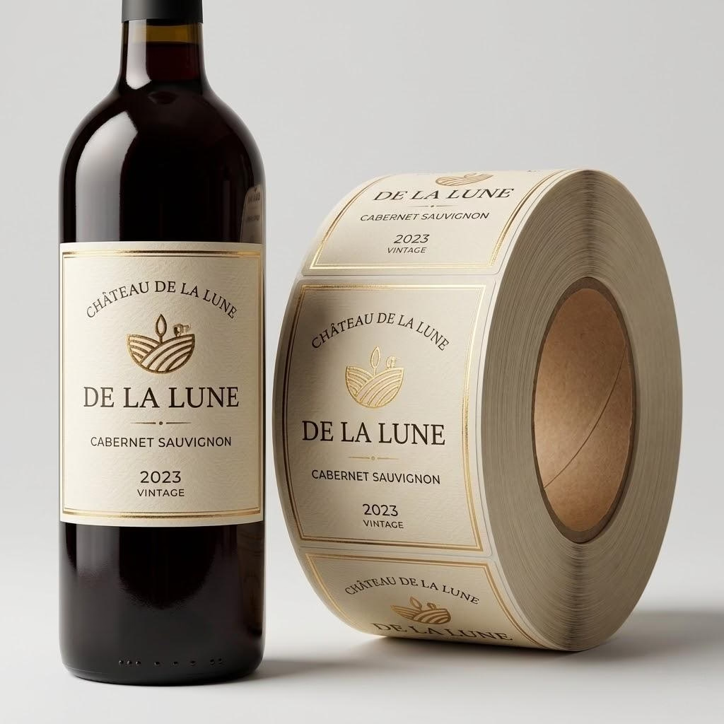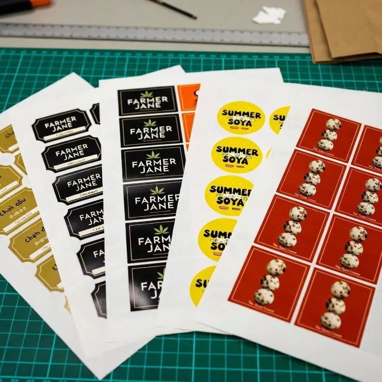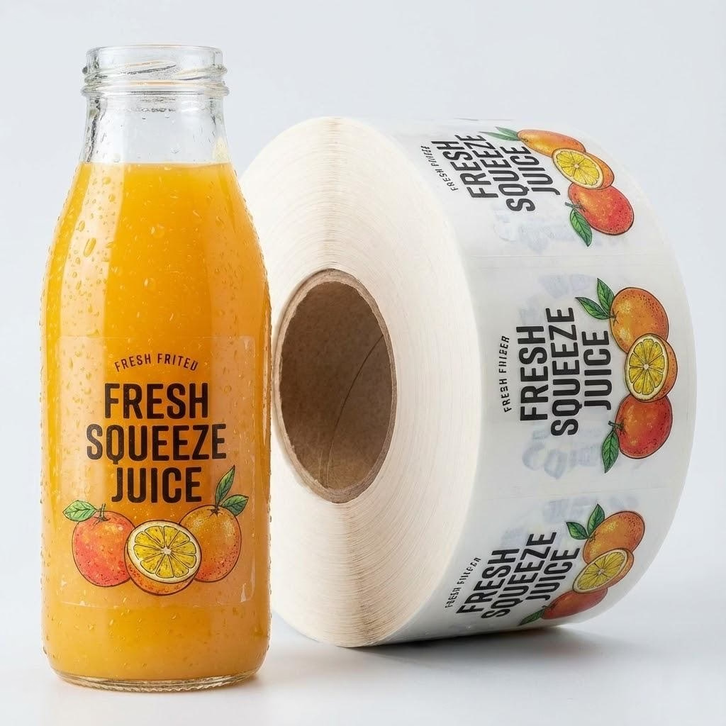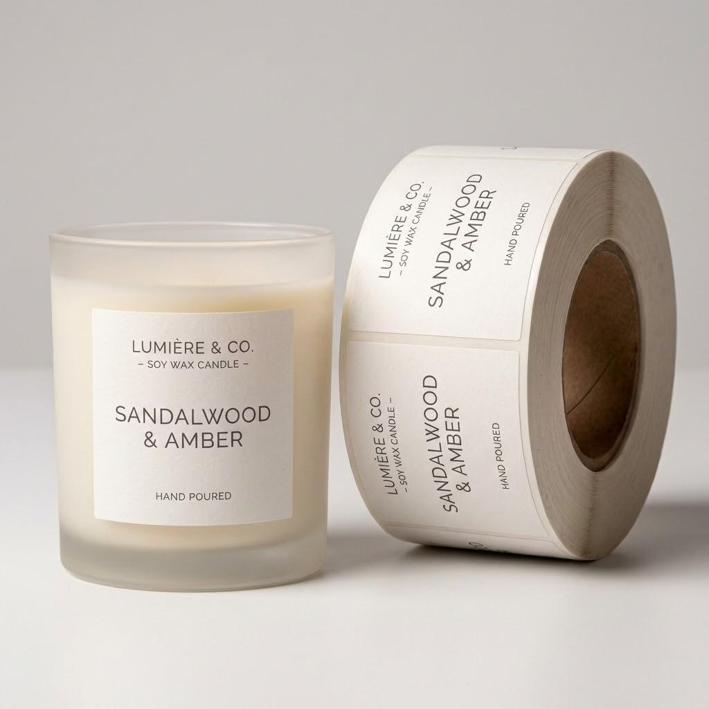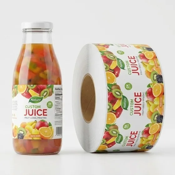
When colorful juice sits in a clear PET bottle, the label film you pick decides whether shoppers read your brand or stare at muddy type on the cooler shelf. You can still lock clear versus white before art goes final and before a 500-label pilot teaches an expensive lesson.
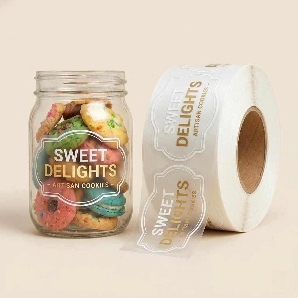
Choose clear BOPP when the drink color is part of your shelf story and copy can sit on white ink or a solid panel; choose white BOPP when barcodes, nutrition blocks, or pale juice need guaranteed contrast without relying on the liquid hue.
Keep reading and you will leave able to match film to drink color, plan white-ink windows, and gate barcode contrast yourself—so the next proof looks premium in hand, not unreadable under store lights.
Match Label Film to Your Juice Color First
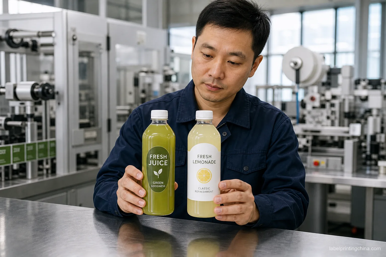
When you ask for “premium clear labels” without naming the fill, a converter quotes ultra-clear BOPP and your forest-green cold-press turns the logo into a brown smear. Start from the juice you will actually bottle—not the Pantone on screen.
| Your bottled juice look | Film call for your RFQ |
|---|---|
| Deep green, red, or purple—you want the liquid visible | Clear BOPP with planned white-ink underprint behind type and logo |
| Bright orange, mango, or sunset blends—color is the hero | Clear BOPP if panels are small; white BOPP if the whole wrap must stay readable |
| Pale yellow, coconut, or light lemonade—liquid reads almost white | White BOPP so brand color and barcode do not disappear into the fill |
| Multi-SKU line with mixed hues on one bottle shape | White BOPP for shared back-panel art; clear only if each SKU gets its own underprint plan |
When a buyer once approved clear film on dark beet juice because the mood board looked great on a white desk, receiving flagged every case for unreadable ingredient lines. Your fix: photograph the filled bottle, not an empty PET shell, and attach that photo to the RFQ before you pick film.
If you still need wet-wall adhesive after the look is locked, route material tests through the juice waterproof labels guide—but freeze clear versus white first so condensation tests match the face stock you will run.
After film color is frozen, run batch-code and cold-chain gates from our cold pressed label checklist.
Write the hue in plain words on the quote line—“deep green cold-press” beats “vibrant natural.” Converters cannot guess whether you mean kale green or kiwi yellow from a logo PDF alone.
Red flag: if marketing picks clear film because the render looked premium on a white desk, run a filled-bottle photo test before you pay plate charges. Empty PET reads lighter than production fill every time.
When two flavors share one bottle, list each fill color on the master spec even if the wrap size matches. A shared die on mixed hues is where clear film quietly fails on the pale SKU while the dark hero flavor still scans.
Plan White Ink and Clear Windows Before Art
Once you pick clear film, the next fight is how much stays transparent and where white ink must sit under CMYK. Designers love full-window bottles; production needs ink stations and dry times you can actually run.
| Your design goal | What you spec on the artboard |
|---|---|
| “No-label look” with logo floating on juice | Mark a white-ink layer only under type and icon; leave at least 30–40% of the panel as true clear film |
| Brand mural with a peek window at the fill | Solid white-ink base on the mural band; one cut-out window with 3–5 mm clear margin so adhesive does not haze |
| Back panel nutrition on a clear wrap | Full white-ink flood behind the back panel only; do not rely on juice color as the background |
| You skip white ink to save a plate | Switch to white BOPP instead—clear film without white underprint fails on most colorful fills |
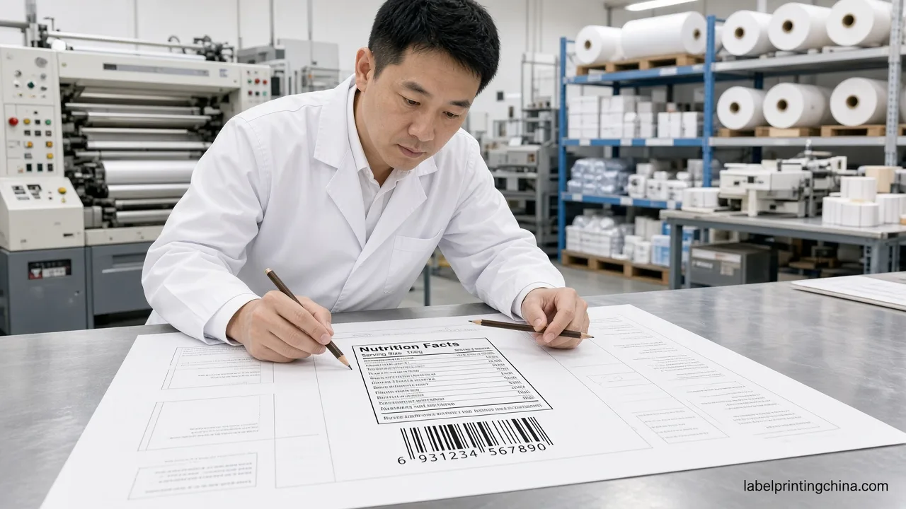
When art once shipped as one merged layer, the press operator had to guess where white should sit and the first pull showed ghosted type on orange carrot juice. Split layers: White Ink, CMYK, and Die Line—each named on the PDF you send.
Matte clear film softens glare but also softens small type; glossy clear pops on the shelf yet shows every fingerprint in hand-selling demos. Pick finish with the same fill photo you used for film choice, not from a generic swatch book.
For cosmetic brands chasing a similar window look on jars, the sister logic lives on the clear BOPP cosmetic guide—juice adds fill color and barcode risk that skincare rarely faces.
Keep Barcodes Scannable on Clear Juice Labels
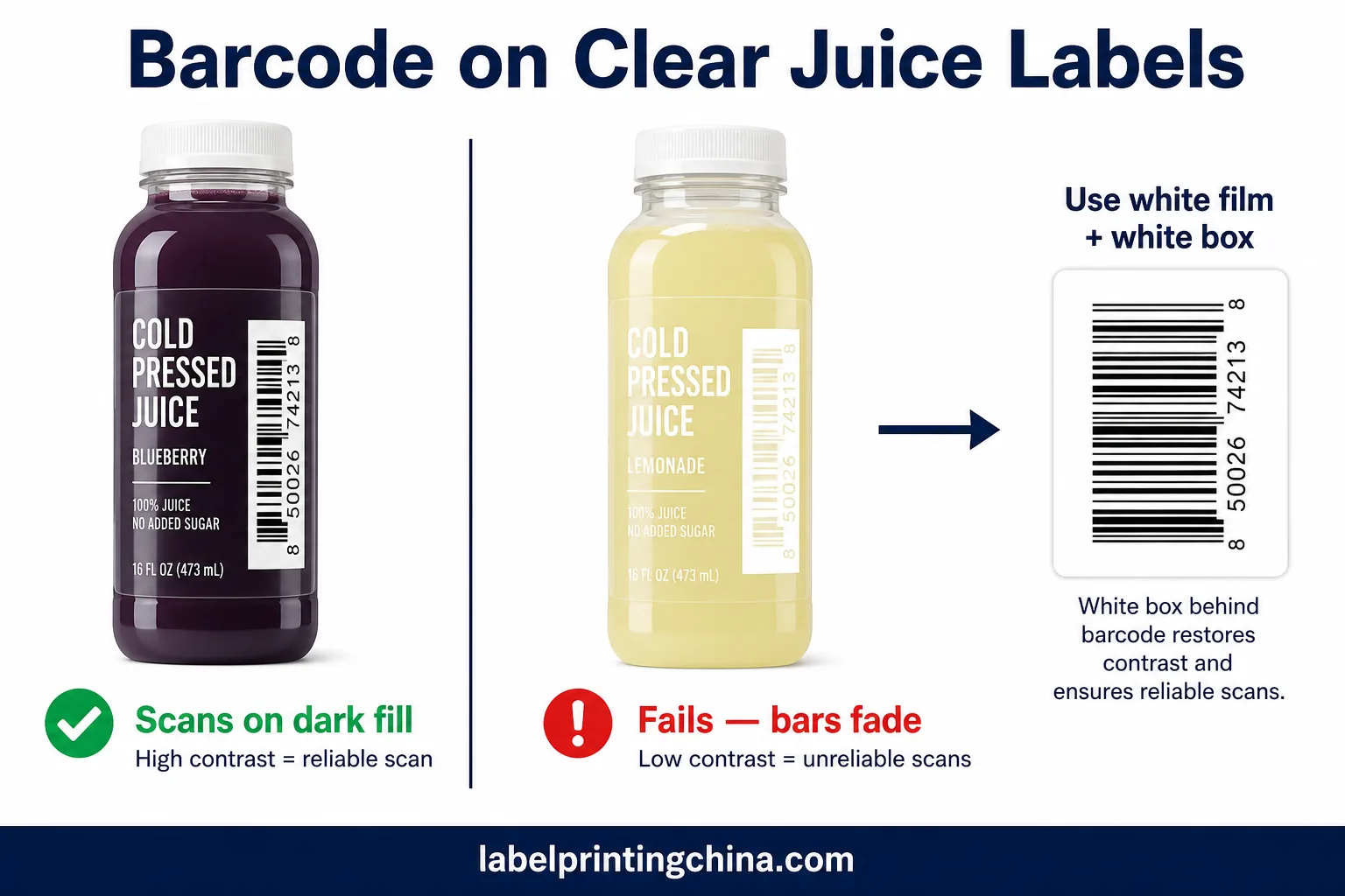
Clear film plus dark juice often scans fine until someone reformulates to a lighter blend. That is when receiving rejects a full pallet—not when marketing notices on Instagram.
| Check on the filled bottle | Ready if… | Hold if… |
|---|---|---|
| UPC on clear film over the fill | Three clean scans at arm length under cool-white LED | Bars fade into orange, yellow, or beige juice without a white box |
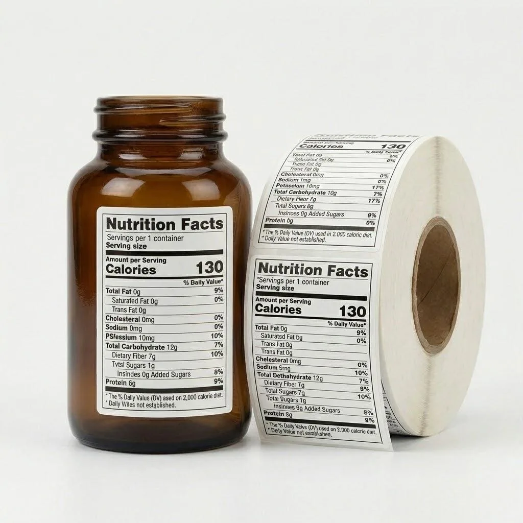
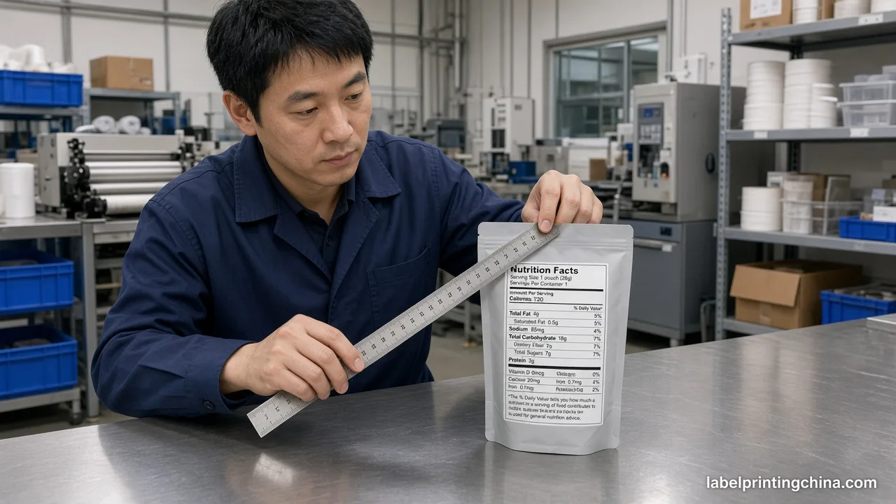
| Nutrition panel on a clear wrap | 6 pt type readable at 30 cm with white-ink flood behind | Fine print picks up bottle color and fails a quick arm-length read |
| QR or Data Matrix for DTC | Quiet zone stays clear film or white ink—not split across both | Code sits half on juice color, half on printed art |
When a functional shot line moved barcode art onto a clear band to “show more bottle,” club stores bounced the lot even though the same code worked on the white-BOPP pilot. Your gate: scan on the darkest and lightest SKU you will run, not only the hero flavor.
Retailers expect quiet zones around the UPC—plan a white box behind the code even on clear front panels so bars stay readable under store LED. Nutrition density questions belong on custom nutrition labels after the contrast gate passes.
For general barcode print specs on curved packs, see the barcode print standards overview—then test on your filled bottle, not on flat proof paper alone.
If one flavor fails the scan test, do not split the run with mixed film on the same SKU code—fix art or switch that SKU to white BOPP and note the change on the master spec sheet.
Need a clear-vs-white juice label recommendation?
Send your bottle photo, drink color, artwork, and barcode file for a clear-vs-white label review.
Test Condensation and Fill Level on Your Proof
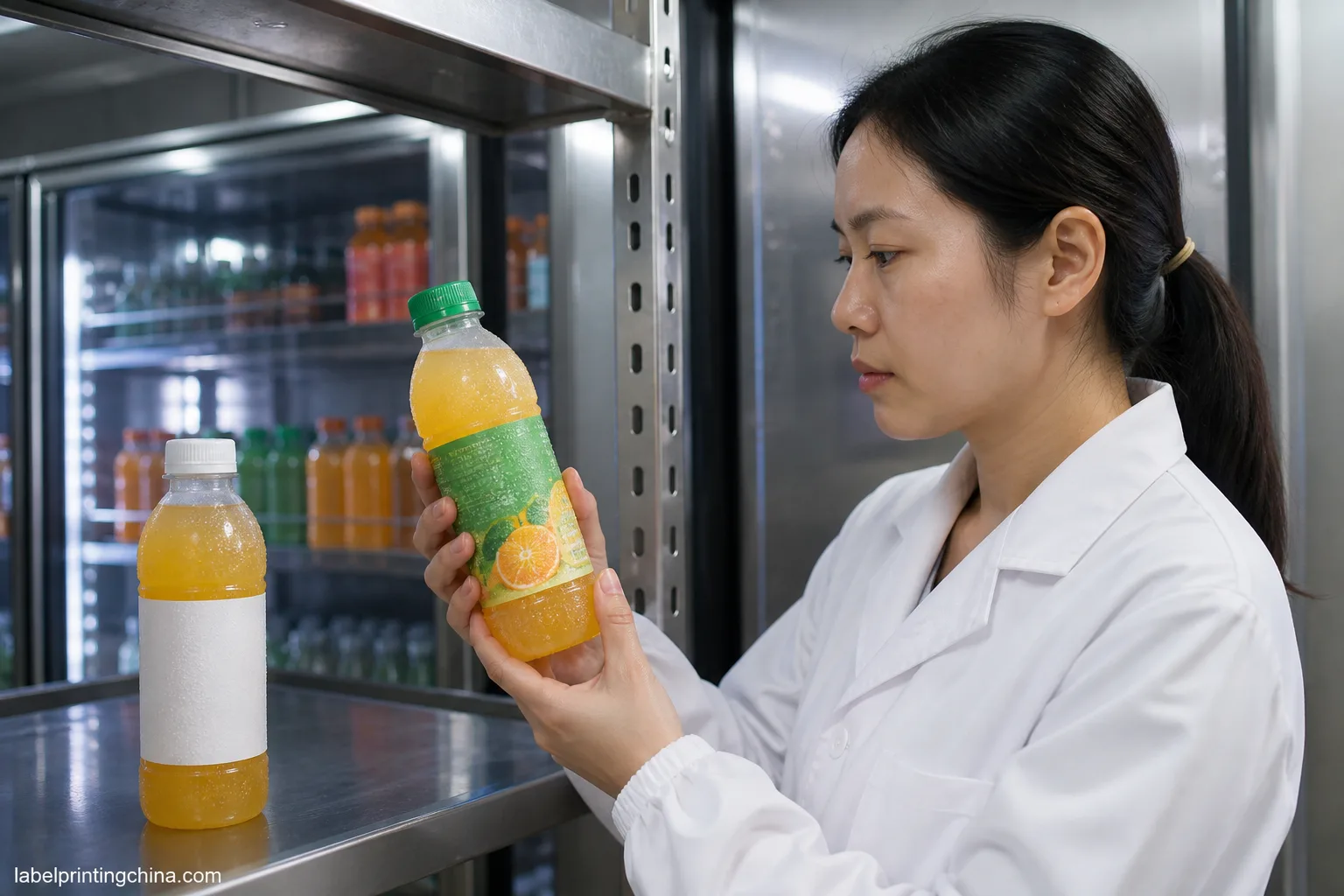
A label that reads perfectly on a dry empty bottle can turn hazy once cold fill and cooler condensation hit the clear window. You need the proof on a wet, filled bottle—not a showroom shell.
- Fill to production headspace, chill 24 hours, then read type through the clear window with case lighting
- Check whether white ink underprint clouds when droplets sit on the laminate
- Compare fill at minimum and maximum batch viscosity—thick pulp shifts how color reads through clear film
- Photograph the wet bottle next to a white-BOPP sample of the same art so sales sees both shelf stories
When a cold-pressed brand signed off on a flat proof but skipped the wet test, store demos showed a milky band across the hero window after the first ice bucket. Your approval photo should show droplets on the label face—that is the shelf your buyer handles.
Beverage lines that mix cans and bottles can borrow cooler discipline from the custom beverage labels hub, but juice clear film fails faster on curved PET than on a matte can wrap.
Hold the clear look if haze stays cosmetic; switch the SKU to white BOPP if claims or barcodes lose contrast when wet. Document the call on the flavor spec so the next reorder does not reopen the debate.
Watch-out: a gloss laminate that looks crisp dry can bloom milky when droplets sit on a clear window—photograph the wet sample under cooler LED, not under office downlights. Pass the wet read test before you release the production PO.
If sales needs both looks in the same line review, ship two filled samples in one box: clear on the hero hue, white on the pale SKU. Side-by-side beats a PDF split screen when leadership chooses film at the last mile.
Lock Clear or White Before Your Juice Label Proof
Clear versus white juice bottle labels stop being a design debate once your RFQ carries fill color, white-ink plan, barcode contrast proof, and a wet-bottle photo. That packet tells your converter which film to quote and tells you what “approved” means at receiving.
When those locks sit in one folder, releasing a 500-label pilot is a controlled step—not a hope that clear film will “probably read fine” on every flavor you launch this season. Reopen the gate if juice formulation or bottle tint changes mid-year.
Send bottle photo, drink color, layered artwork, and barcode file through custom juice bottle labels when you are ready to print against a measured clear-or-white call—not after the first unreadable case hits the dock.