When a long ingredient list already carries approved wording, the remaining risk is layout: type hierarchy, leading, panel splits, and language versions that still fit the die and survive print.Buyers who treat “text is done” as “file is press-ready” often discover overflow only after a physical mockup at finished size.
Treat approved ingredient copy as locked text, then set hierarchy, leading, and panel splits so ingredient label printing stays readable at die size. Keep each language as its own locked file, and preflight bleed, fonts, and barcode against the latest approved copy before press.
You will leave able to lock hierarchy before the list crowds, split panels when the die is tight, version multilingual files cleanly, and run a print-readiness checklist—so the next long-list reprint does not restart from unreadable type.
Lock Type Hierarchy for Long Ingredient Lists
Lock a clear Ingredients heading, one continuous block, high-contrast type, and leading that still reads at die size—not only on screen.Use this when approved ingredient copy still overflows or looks fine in PDF but fails at physical size. Zhongda assesses layout executability only; the customer owns approved wording and legal fitness of the list.
| Layout choice | Keep / Write this |
|---|---|
| Ingredients heading | Bold, distinct from body list; never buried in brand copy |
| List body | One continuous block; avoid decorative or condensed faces |
| Contrast & leading | Dark on light; line spacing that still opens at physical size |
| Die-size check | Print a mockup at finished size before you freeze art |
Industry how-tos stress minimum readable type, simple fonts, and high contrast for ingredient panels—see practical notes on ingredient label readability.A list that looks fine at 200% zoom can still fail when the lowercase “o” height and leading collapse on a narrow wrap around a bottle. Prefer one clean Ingredients block over stacked mini-columns that create uneven rivers and missed allergen emphasis.
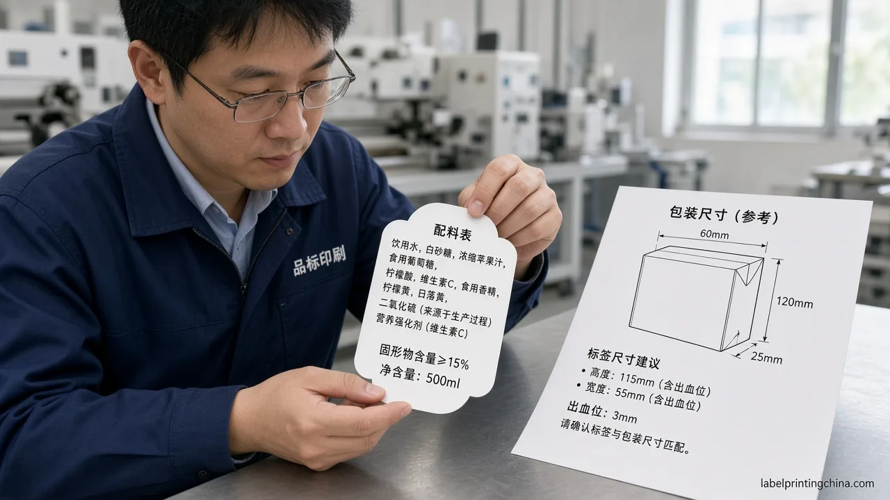
Pass / Fail cue: if a printed mockup at finished size needs squinting or the heading merges into the list, the hierarchy fails—raise contrast or leading before you touch brand colors.For a 50 × 80 mm wrap band, start by confirming the Ingredients heading stays at least one clear step above body size, then open leading until commas and allergen terms do not collide. If the list still forces sub-6 pt equivalents on the physical piece, stop shrinking and move to panel split instead of hoping a denser PDF will print cleaner.
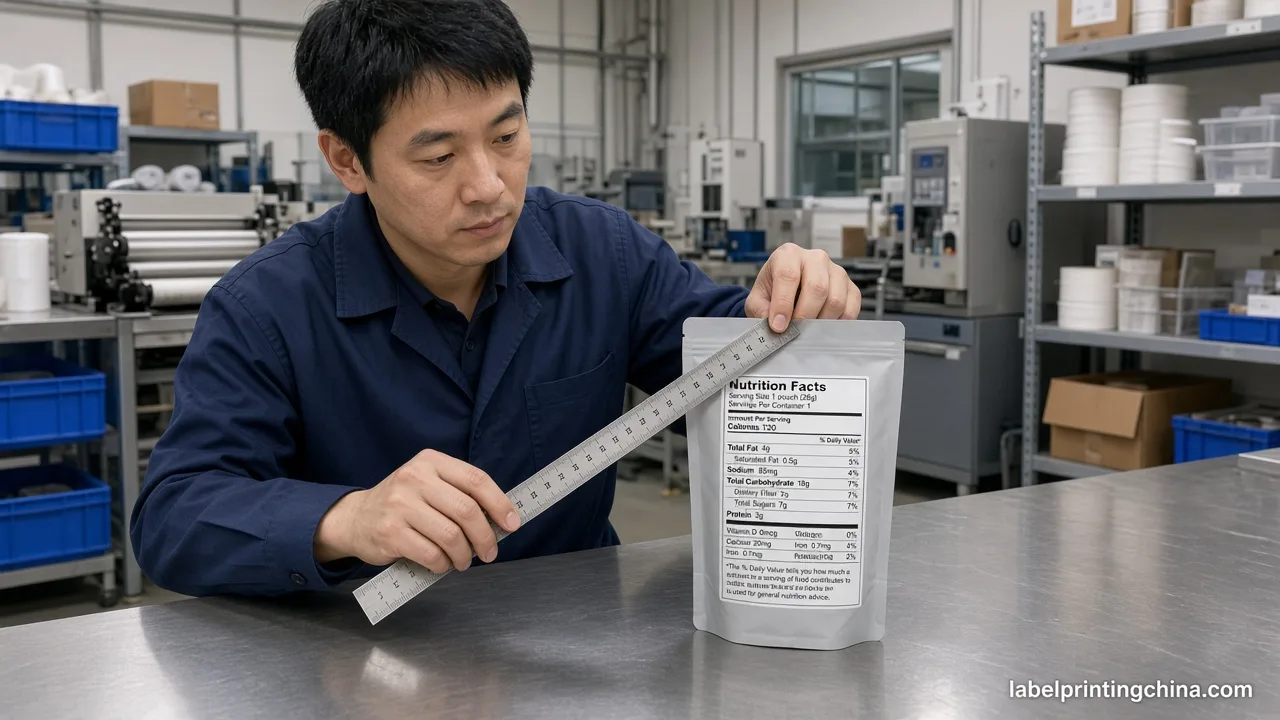
Buyers repeatedly send package dimensions with artwork because die size—not the design screen—decides whether the ingredient list label remains scannable after application. Measure the printable band in millimeters, subtract safe margins, and only then judge whether hierarchy alone can hold the approved copy.
Split Panels and Lock Multilingual Files
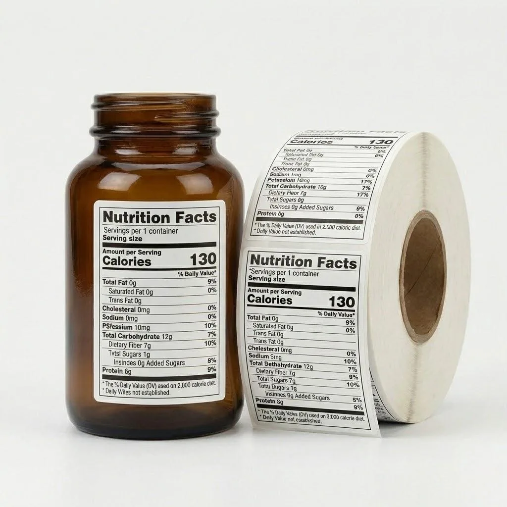
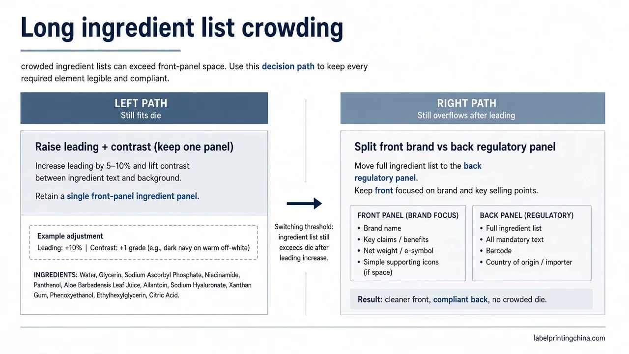
Split brand versus regulatory panels when the die is tight, and treat each language version as its own locked file with matching die size.Apply this when one face cannot hold the full list plus allergens and barcode without crowding. This does not redesign Nutrition Facts legal layout—that stays on the sister FDA formatting page.
Once ingredient artwork is print-ready on flat packs, still prove the tub wrap path with canister label print map so Supplement Facts and the lot strip survive taper and scoop handling.
When the die is that tight on pouches or small cans, map the whole face with small pack layout guide so nutrition, ingredients, barcode, and lot each keep a readable band.
| Situation | What to do |
|---|---|
| Die holds brand + full list cleanly | Keep one panel; protect leading and margins |
| List + allergens + barcode crowd the face | Move regulatory block to back/secondary panel |
| Two or more languages | One locked artwork file per language; same die size |
Watch-out: mixing EN/ES copy in one mutable file is how the wrong allergen line ships. Name each language file with SKU + language + revision, and do not squeeze both languages by shrinking type below the die-size pass.
Once ingredient panels are print-ready, lock retail scan geometry with food barcode placement so quiet zones and laminate glare do not fail at checkout.
After ingredient artwork is print-ready, lock batch marking with date code label choices so changing dates do not force a full-color reprint.
Keep brand storytelling on the front when the regulatory block needs a calmer back panel. That split is a production decision, not a branding argument: if allergens, net contents cues, and barcode fight the hero claim for the same millimeters, the claim loses readability first.Nutrition Facts legal panel geometry is out of scope here—hand that design path to FDA nutrition formatting. Write die size, approved copy ID, and language versions on the RFQ before artwork freezes. This page stays on ingredient-list executability: whether the approved list, allergens, and barcode still fit after hierarchy and panel decisions.
For multilingual SKUs, treat each language as a separate press file with identical die size and bleed.Soft “layered” files where translators overwrite the same text box create silent version drift—especially when one market adds an allergen statement another market does not require. Lock EN_r03.pdf and ES_r03.pdf (example naming) only after both mockups pass the same die-size readability check.
Preflight Print-Ready Ingredient Artwork
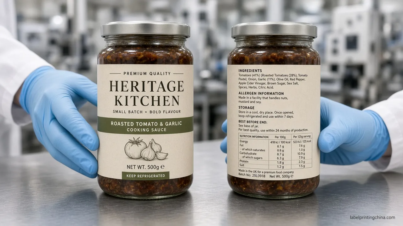
Confirm finished size, bleed and safe area, outlined fonts, 300+ DPI raster, and that ingredients, allergens, and barcode match the latest approved copy before pre-press.Use this checklist before you release ingredient label printing files to production. Proofreading of wording remains the buyer’s responsibility; this is print-readiness, not legal certification.
| Preflight item | Pass signal |
|---|---|
| Finished size + bleed | Die matches pack; bleed ~1/16 in; copy inside safe area |
| Fonts & images | Fonts outlined or embedded; raster ≥300 DPI |
| Approved copy lock | Ingredients, allergens, barcode match latest signed version |
Converter print-ready guides emphasize finished size versus bleed, safe area, outlined fonts, and high-resolution raster.Food brands should also confirm the ingredients, allergens, and barcode lines are the latest approved revision before pre-press—not an older deck left open in the design file. Customization and artwork packages that omit the signed copy version force a second preflight loop even when the die geometry is correct.
Walk the checklist in order: (1) die size and bleed match the pack drawing, (2) safe area keeps the Ingredients heading and barcode quiet zone clear of knife lines, (3) fonts are outlined or fully embedded, (4) any photo/logo raster sits at 300 DPI or higher at final size, (5) ingredients/allergens/barcode text hashes to the approved copy ID your regulatory owner signed.Skip step 5 and you can print a perfect file of the wrong words.
Red flags before you release files:
- PDF zoom looks fine, but no die-size print mockup exists
- Language versions share one unlocked working file
- Barcode or allergen line older than the signed copy deck
- Asking the printer to “make it fit” by shrinking type past readability
After print-readiness, line QC for shipped nutrition labels can follow nutrition label inspection—a different job from locking hierarchy and files. Quality and compliance checks in buyer RFQs often mean “will this print cleanly and match the approved deck,” not “please certify FDA legal design.”
Ready for a print-readiness review?
Send your package dimensions, approved ingredient copy, language versions, barcode, and artwork for a print-readiness review.
Record ambient lighting when you photograph the mockup for remote review: glare can hide low-contrast ingredient lines that still fail in hand. Keep one marked-up print in the RFQ folder so the printer sees the same die-size evidence you approved.
Send Your Ingredient Print-Readiness Pack
Long lists become press-ready when hierarchy, panel splits, language locks, and preflight all agree with the same die size—and when wording stays with the brand, not the printer. That gate is what lets a print-readiness review turn into a confident volume quote instead of another artwork loop.
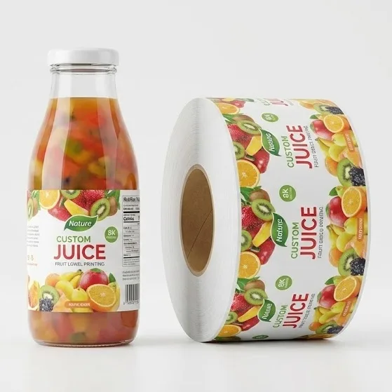
If your SKU also needs juice bottle barcode and nutrition panel geometry on curved packs, use juice panel placement after this ingredient-list layout is locked.For custom production of nutrition and ingredient labels, send the RFQ pack above to Label Printing China and keep the approved copy ID in the same email as the die drawing.